Roots need some Critique

JimFox

Moderator
Staff member
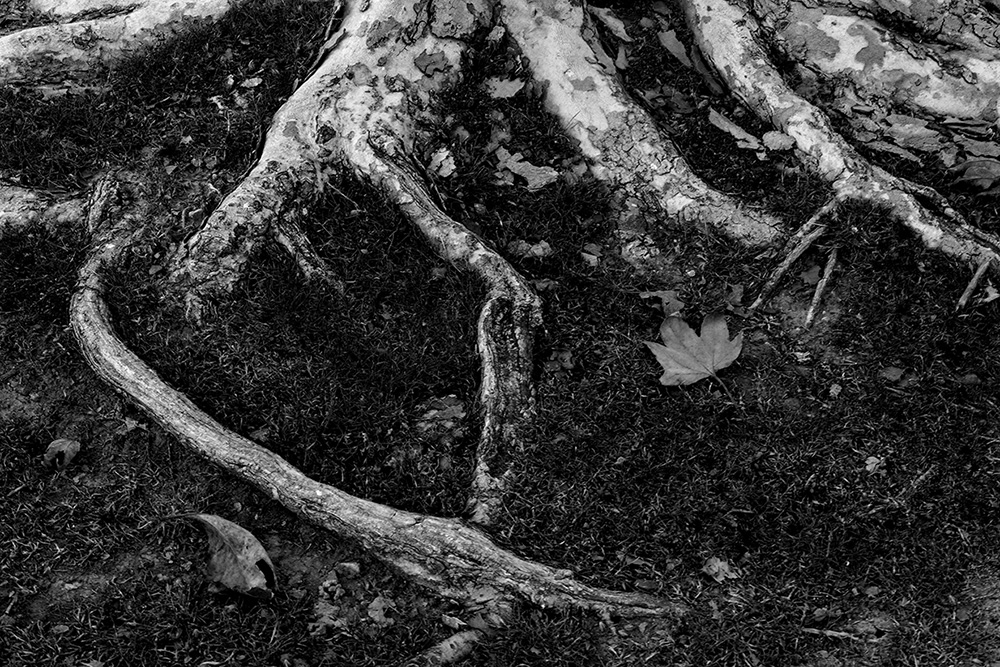
I posted a B&W of this a few days ago and it didn't get any comments, so I figured it must be so bad that I better post it here in Critique and see how it could be improved from what I did.

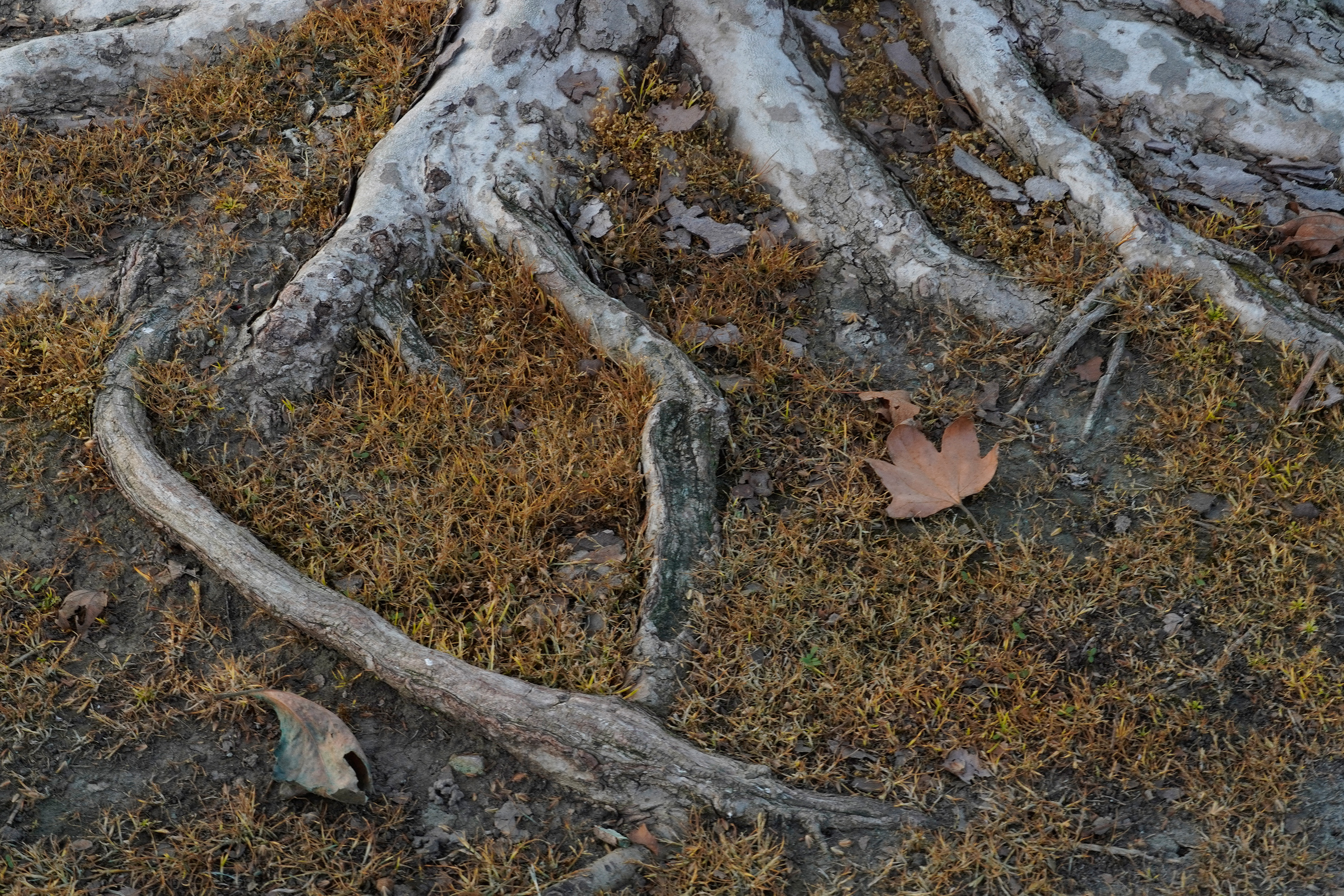
Here is the SOOC shot resized to 3000 pix for everyone to start with.

Here is my B&W work for reference.
_A641269_BW_dw.jpg


Please help, thanks Jim
 

AlanLichty

Moderator
The roots need an anchor. I find my eyes wandering around the scene looking for the hook thats supposed to drag me into the scene and I can't quite find it. The color version offers a better visual anchor with the leaves - maybe a new crop that placed the full leaf on the right in a more prominent location. You could easily lose some of the lower left corner to do that.

At least in the coastal NW exposed roots like this are an incredibly common sight and most of the trails have roots like this all over the place. I am usually looking for something in the scene to be the hook that will drag the viewer's eyes into the image.
 

JimFox

Moderator
Staff member
Thanks for the feed back you guys. I had found that the lead towards the middle pulled my eye in with the roots almost cradling it. I just must be seeing it differently.
 

Carlo Didier

Well-Known Member
Agree about cropping. Ben gives a good example, even without including the leaf.
Very often, if you think an image doesn't work, try simplifying.
 

JimFox

Moderator
Staff member
That’s pretty good Alan! I guess it was that curving root causing the issues.
 

JimFox

Moderator
Staff member
Now I hate to ask for too much, but I really wanted this in B&W. How does Bens or Alan’s crop look best in B&W?
 

Jameel Hyder

Moderator
Staff member
I think it would look good - however the dark look isn’t working for me. I am on the road so can’t actually attempt a version.
 

AlanLichty

Moderator
Here ye be - B&W:

JimsRoots_3000pixBW.jpg


I just got through updating my Topaz Labs modules and was playing around with DeNoise AI's chroma filters and decided to try one more variant in color.

JimsRoots_3000pix2.jpg
 

Ben Egbert

Forum Helper
Staff member
Nice ones Alan. Did you use Topaz for the B%W conversion? I need to get back into Denoise AI and figure it out. I still use the older Denoise.
 

beavens

Forum Helper
Jim,

I feel that this is suffering some from a couple issues: the comp isn't terribly engaging and the light is super low contrast.

Personally I feel roots work best in two ways - an in-your-face 3D look, or a neat almost-2D flatter look. I think this shot lands somewhere in between those.

But if you're looking to recover I vote for some heavy-handed processing, along with a little 'artistic license'.

My thoughts below.

Untitled-1.jpg


Jeff
 

AlanLichty

Moderator
Nice ones Alan. Did you use Topaz for the B%W conversion? I need to get back into Denoise AI and figure it out. I still use the older Denoise.
I used Topaz for DeNoise, touched up the contrasts in Topaz Studio, and then used Silver Efex Pro for the B&W. Do get the upgrade - they have added some nice things.
 

JimFox

Moderator
Staff member
Jim,

I feel that this is suffering some from a couple issues: the comp isn't terribly engaging and the light is super low contrast.

Personally I feel roots work best in two ways - an in-your-face 3D look, or a neat almost-2D flatter look. I think this shot lands somewhere in between those.

But if you're looking to recover I vote for some heavy-handed processing, along with a little 'artistic license'.

My thoughts below.

View attachment 24955

Jeff
Hey Jeff, I like you take on this. My idea was for wanting a darker B&W that is often seen in fine art work and like @Ken Rennie is so good at.
 

JimFox

Moderator
Staff member
Here ye be - B&W:

View attachment 24952

I just got through updating my Topaz Labs modules and was playing around with DeNoise AI's chroma filters and decided to try one more variant in color.

View attachment 24953
Hey Alan, thanks for that B&W conversion, it does look really nice. As I mentioned to Jeff, I wanted to go with one of those dark B&W looks often seen in Fine Art B&W. Perhaps this simply isn’t the image for it.

It is very educational to see the various edits on this.
 
Top Bottom