Skye Blues (opinions wanted)

Ken Rennie

Well-Known Member
I am just back from six days in Skye NW Scotland. The light was very soft throughout with dull heavy mush on the horizon making sunrise and sunset non events. Enough of my problems, it was still a great place to be. This is a blue hour long exposure (500s) from Elgol, while I was contemplating the shot a pod of 5 or 6 dolphins swam past about 50 feet (15m) away, even if I didn't get a decent image I was happy having seen these lovely creatures effortlessly swim past. 3 images
a) Almost straight out of camera.
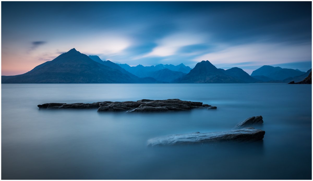
_DSC6438-1.jpg


b) a mono conversion with some burning and dodging with some extra sharpening to add texture.
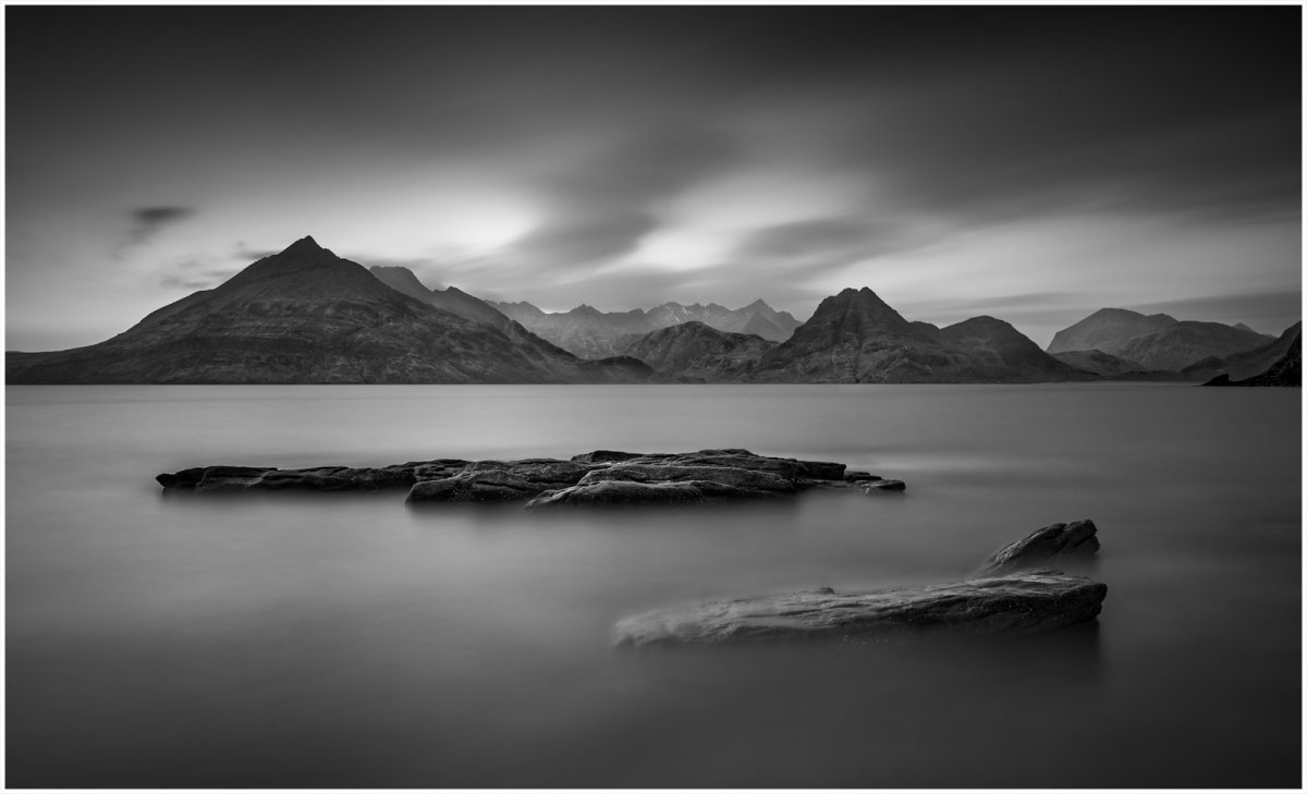
_DSC6438-1 from laptop mono.jpg


c) the original colour version applied as a colour layer, this gives a more detailed colour version.
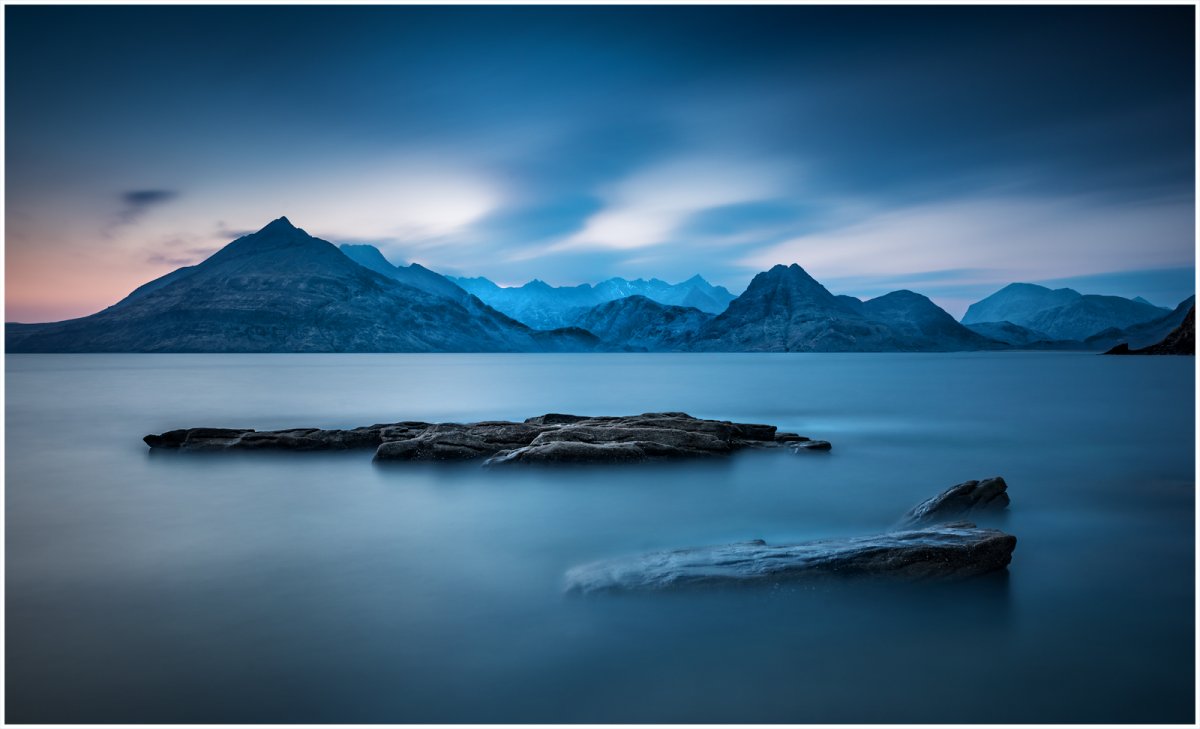
_DSC6438-1 from laptop colour detail.jpg


I like them all and at the moment it is like trying to pick your favourite child so please give me your thoughts. Ken
 
Last edited:

Jim Dockery

Well-Known Member
My first glance I prefer the B&W since that's my thing. Between the colors #1 for me - the lack of detail in the mountains makes it even more minimalistic and almost abstract. Excellent work with dull conditions.
 

AlanLichty

Moderator
The first one grabbed me the moment I opened the thread and still kept me looking back after seeing the other two. I do like the softer detail in the mountains in the first image as it blends in the with the soft mood to the water surface.
 

JimFox

Moderator
Staff member
Very interesting children you have here Ken! :)

I think I may lean with Alan on his choice of #1. I think the background softness blends into the long exposure and blue look well. Just having the one area of sharpness in the middle rocks let's the eyes gravitate there. I think in #2 and 3 with the background mountains sharper and more contrasty the eye gets pulled back and forth more from the middle sharp rocks to the sharp background rocks.

While the B&W is appealing and could stand on it's own, there is just something about the blue hour and how you captured it in #1 that elevates it above the B&W.
 

MonikaC

Well-Known Member
I prefer #1 because of the softness/lack of detail. though you could split the difference in the 2 color versions & add the detail just to the rocks in the mid ground. I usually prefer B&W, but the muted colors work better for me in this case.

Were you wishing for a 2nd camera setup when those dolphins swam by? I would have been.
 

Ken Rennie

Well-Known Member
_DSC6438-1 from laptop darker front rock.jpg
Thanks everyone. I think the first one is my favourite although I may make minor adjustments, this has the foreground rock darker. As for having a second camera to photograph the dolphins, I do not photograph moving things and am probably too slow to line things up whether I had a top of the line action camera set for action or not. Anyway I am happy to have seen them. Ken
 
Last edited:

lionking

Well-Known Member
I think you have a strong image regardless of your expectations.
I prefer the 1st too, the FG rocks are beautiful, but grab to much attention from the main subject imho, i would consider cooling them down.
 

AlanLichty

Moderator
Thanks everyone. I think the first one is my favourite although I may make minor adjustments, this has the foreground rock darker. As for having a second camera to photograph the dolphins, I do not photograph moving things and am probably too slow to line things up whether I had a top of the line action camera set for action or not. Anyway I am happy to have seen them. Ken
You are going to hate me but I still like the softer shot at the top. Sometimes SOOC is the right spot all along :)

For some reason that first image speaks to me more than the rest.
 
Top Bottom