Please C&C
- Thread starter lionking
- Start date
First off, if you really seek critique rather than presentation, I suggest the critique forum. Second, I really like this one. I have no critique to offer, just praise.
Ryan10
Founding Member
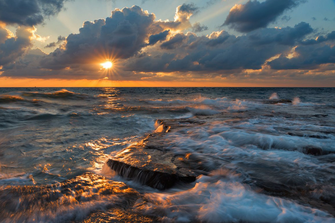
I like the composition a lot. Nice rock line leading to the horizon. The shutter speed is PERFECT in my opinion. I think the post processing is done nicely.Hi!
This one is kinda love/hate relationship, the blown highlights kinda killing it for me, in the other hand there is a lot going on here, so its kinda interesting, i am not sure what to do here, any ideas?
Thank you!
AndreyView attachment 2384
With that said, the sun, even though you've controlled it well, is still just a bit too bright for me. Even some of those highlights in and around the rock are a bit too hot, as you stated.
Kyle Jones
Moderator
I like your original image a lot - and the hot spots don't bother me because I expect them to be hot (the sun and some reflections of the sun). But, since we're playing around, here's another interpretation... I used a color balance filter to push it a little toward red (away from cyan), magenta (away from green), and blue (away from yellow). Just a little bit on each one. I added some contrast in the sky above the cloud to try to bring out those rays a little more.
I also cropped from the bottom and left trying to take out most of that splash on the left side. This left the right side a little plain, so I did some dodging in the waves on the right to try to add a little more interest. The net result isn't all that different than yours, which I frankly liked as is.
")
I also cropped from the bottom and left trying to take out most of that splash on the left side. This left the right side a little plain, so I did some dodging in the waves on the right to try to add a little more interest. The net result isn't all that different than yours, which I frankly liked as is.
Hey Ryan,
Your comment about the sun being too bright got me to thinking. It's not that the sun is too bright, it's that the water layer is too dark.
Often brightness is relative, the sky brightness is in relationship to the ground/water.
I will post a sample of what I am thinking later after dinner.
Jim
Your comment about the sun being too bright got me to thinking. It's not that the sun is too bright, it's that the water layer is too dark.
Often brightness is relative, the sky brightness is in relationship to the ground/water.
I will post a sample of what I am thinking later after dinner.
Jim