Lets play - Poll Added - Please Vote for your Favorite

Which is the Best Edit? (Find the Post# in the lower right of each Post)

  • Post #6

    Votes: 0 0.0%
  • Post #7

    Votes: 0 0.0%
  • Post #20

    Votes: 0 0.0%
  • Post #26

    Votes: 0 0.0%

  • Total voters
    5
  • Poll closed .

Ben Egbert

Forum Helper
Staff member
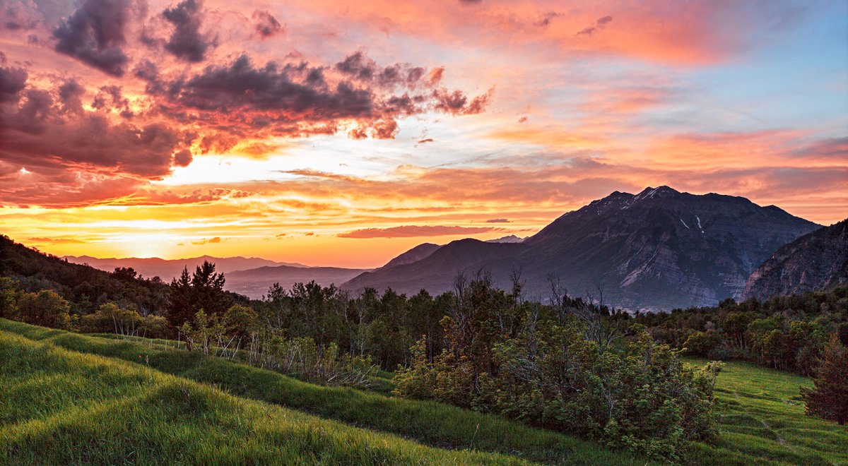
This is an image that required HDR in the past. Last night I tried Jim's luminance mask process and got the following results. I think I could do better if I tried a three step process using an even brighter image in the mix, but thought this is a good starter.

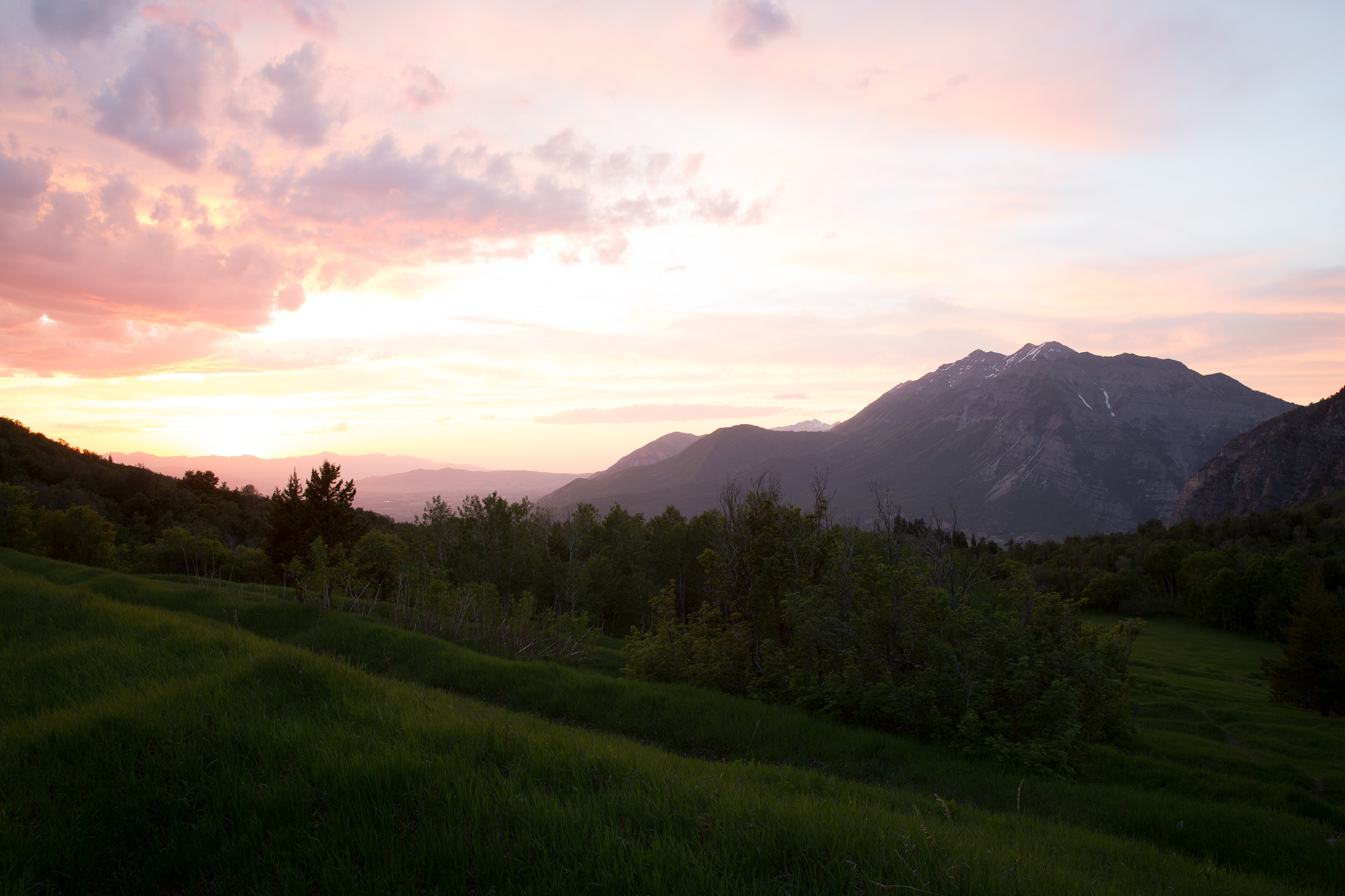
feel free to download my 3000 wide unprocessed jpgs for your own versions. See the reply for the 3k versions.

My version.

140610-7535-5dm3 BW SHARP V crop.jpg
 

JimFox

Moderator
Staff member
Your version looks pretty good Ben!

I will download these, and play with them a little later this afternoon. I have a few things to take care of first, it will be fun to play with these.

Jim
 

Ben Egbert

Forum Helper
Staff member
Hi Jim, I tried a three tier version where I blended middle and dark, then laid that on the lightest version (not uploaded here) and it fizzled.

These line up pretty well, but an align image step is worth doing.

I wonder if it is good to do as much preliminary work on the individuals in ACR as I did here. I also see its possible to use a gradient on the blend if the bottom is too dark.

These are 5D3 images and have a lot of shadow noise, so am NR step is required. My 5Dsr would not require that as much.
 

JimFox

Moderator
Staff member
Hey Ben,

Yeah, doing prelim work in ACR is almost always a good idea. The time to be careful with that is when there is a sharp contrast between the ground layer and say a clear sky with no detail.
 

Ben Egbert

Forum Helper
Staff member
Here is another cut. After doing the luminance mask step using the two images, I put the dark one back in and did a simple gradient to darken the sky. Then I added the bright one and did another gradient to brighten the foreground. Then I did not usual processing from that point on.

140610-7517-5dm3NR BLND BW SHARP V.jpg
 

JimFox

Moderator
Staff member
Hey Ben,

I did a pretty quick edit. I can go over the details later if you like this direction. Right now, I am late getting to the beach to run. :)

Jim

140610-7536-5dm3_a2w.jpg
 

Ryan10

Founding Member
Ben...Here is what I have to offer...

With many of your images, I feel the ground to sky conversion almost always look "muddy" if that makes sense. I think @JimFox is absolutely correct, that high contrast areas can take on this appearance if adjustments are not made correctly.

In the image you posted above, the mountains seem dull compared to everything else and the sky near the sun looks a big muddy.

I don't know that I can offer much from a composition standpoint.
 

Ben Egbert

Forum Helper
Staff member
Hey Ben,

I did a pretty quick edit. I can go over the details later if you like this direction. Right now, I am late getting to the beach to run. :)

Jim

View attachment 2393
Hi Jim, not sure you saw my last take on this which is so far my favorite. Your has a good tonal range, but seems a bit flat.

Ben...Here is what I have to offer...

With many of your images, I feel the ground to sky conversion almost always look "muddy" if that makes sense. I think @JimFox is absolutely correct, that high contrast areas can take on this appearance if adjustments are not made correctly.

In the image you posted above, the mountains seem dull compared to everything else and the sky near the sun looks a big muddy.

I don't know that I can offer much from a composition standpoint.
Those were jpgs, we have not figured out how to embed raws. I am not sure what muddy means, unless lack of contrast. In my most recent redo, I feel like it is pretty crisp, there is fog/haze in the valley below the sun, and of course the large mountain at the right is in complete shade, but I feel like I have provided enough detail short of an HDR treatment to work.

Anyway, I do appreciate your dropping by and telling me what you think because it will help give me a sense of what's expected by others.
 

Kyle Jones

Moderator
Here's my quick take. I loaded the two images as layers and aligned them. I then used the quick select tool to select the sky, including "select and mask" to refine it. I applied that mask to the darker image and noted that the mountains (pulled in from the lighter image) were two bright. I created a new selection that included everything above the grassy area (select and mask helped me with the trees/brush that extended into this area) and used that selection to paint white with a 10% opacity over the mountains until I liked how they looked. The selection kept this from affecting the grassy area.

From there I used the camera raw filter on the whole image to open up the shadows and bring down the highlights, did some dodging on the grass and mountain, and added a curve for some more contrast in the sky.

140610-7536-kyle.jpg
 

BarryHamilton

Founding Member
Kyle, that's very close to what I came up with. I loaded both in Lightroom, tweaked and then opened in PS as layers, as you did.
Did the same mask as you then added just a touch of contrast to the mid ground mountains, without letting them be too bright from the fg layer, again just like you!
This is going to look very much like yours! :)
Note that, as Jim will confirm, I tend to like images with softer contrast and less saturated colors than many, so as they say, ymmv!

140610_BH_3.jpg
 

Ben Egbert

Forum Helper
Staff member
Here's my quick take. I loaded the two images as layers and aligned them. I then used the quick select tool to select the sky, including "select and mask" to refine it. I applied that mask to the darker image and noted that the mountains (pulled in from the lighter image) were two bright. I created a new selection that included everything above the grassy area (select and mask helped me with the trees/brush that extended into this area) and used that selection to paint white with a 10% opacity over the mountains until I liked how they looked. The selection kept this from affecting the grassy area.

From there I used the camera raw filter on the whole image to open up the shadows and bring down the highlights, did some dodging on the grass and mountain, and added a curve for some more contrast in the sky.

View attachment 2394
Thanks Kyle, this is a very nice version. Looks great on screen probably a bit dark for print, but that was not the test. I am pretty sure I did something very similar back when I took this shot, but you must be better at masking them me. Poor masking is why I go with methoids like Jim's Luminance mask.

Kyle, that's very close to what I came up with. I loaded both in Lightroom, tweaked and then opened in PS as layers, as you did.
Did the same mask as you then added just a touch of contrast to the mid ground mountains, without letting them be too bright from the fg layer, again just like you!
This is going to look very much like yours! :)
Note that, as Jim will confirm, I tend to like images with softer contrast and less saturated colors than many, so as they say, ymmv!

View attachment 2399
Hi Barry, As we get used to each other we will not doube see personal preferences. I do like your version a lot, I would maybe raise the shadows and add back some contrast, but that's just a personal preference. This sort of exercise is a great way to see how everyone thinks.
 

Kyle Jones

Moderator
Thanks Kyle, this is a very nice version. Looks great on screen probably a bit dark for print, but that was not the test. I am pretty sure I did something very similar back when I took this shot, but you must be better at masking them me. Poor masking is why I go with methoids like Jim's Luminance mask.
I don't really trust any masks. I tend to use them as a starting point and then do some low opacity strokes (often alternating black and white) to blend in the transition a little bit. Sometimes I'll use a luminance mask to help me paint within the lines. In this case, your midground makes a great place to manually transition between the sky and grass.

I was tempted to take this really dark (which seems to be all the rage these days but isn't really my style). The more dark contrast I added the more some of the details began to pop. I ended up backing off. I really like your image. Great layers and colors!
 

JimFox

Moderator
Staff member
Did Ben post the RAW files, or did you just grab the JPGs he posted?
Hey Ryan,

We can't upload Raws, but we definitely have a much better system set up then most forums.

We set up a Gallery just for the Critique forum, which allows anyone to upload hi res jpgs. Then when posting in the critique forum you upload to that Gallery first, then in your post, you link the photo from the Gallery. That way when you right click to download you are downloading a hi Res jpg.

Hi Res jpg isn't bad to edit, it's not a raw, but for the purposes of critique its' so much better then a low res jpg.

Jim
 
Top Bottom