Mike Lewis
Staff Member
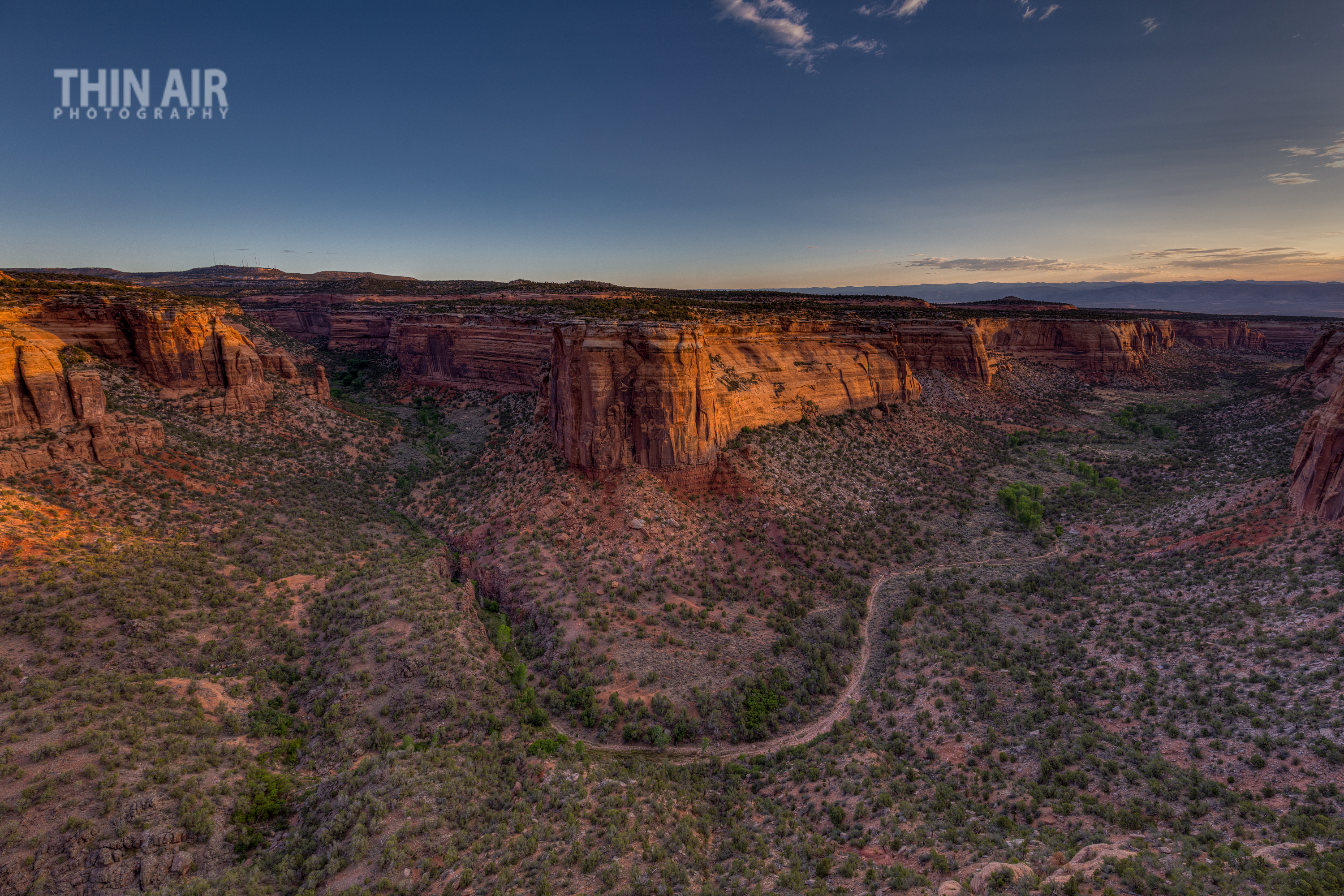
So just got back from a 2 night stay at the Colorado National Monument. I have wanted to get there for a while now and I must say it did not disappoint. I probably got about 5 images that I will add to my website from the trip, but this one is my favorite for a couple reasons.
- I love how it came out")
- It represents one of the few times I was able to research an area online, scout a particular location in varying light, plan a shot, and then get up early and go execute it. I even had the time and patience to wait on the light for a while to let the sun finally shine up over the top of the low clouds to the east.
This is about 30 minutes after actual sunrise, at the 2nd of the Ute Canyon access points (Ute Canyon View) that one comes to when driving from the campground. This is a blend of multiple exposures.
Of course, I am still happy to take critique and feedback on this as there are almost always things that could be improved.
ML
- I love how it came out
- It represents one of the few times I was able to research an area online, scout a particular location in varying light, plan a shot, and then get up early and go execute it. I even had the time and patience to wait on the light for a while to let the sun finally shine up over the top of the low clouds to the east.
This is about 30 minutes after actual sunrise, at the 2nd of the Ute Canyon access points (Ute Canyon View) that one comes to when driving from the campground. This is a blend of multiple exposures.
Of course, I am still happy to take critique and feedback on this as there are almost always things that could be improved.
ML