Along the Gros Ventre River

Ben Egbert

Forum Helper
Staff member
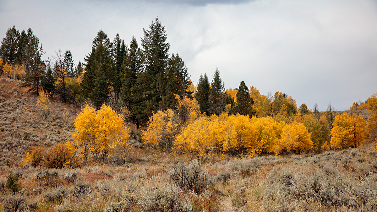
I was with Alan, Jim and Rick when we stopped at this place along the Gros Ventre River (Grand Tetons) the last week of September.

I am not sure this is a presentation level image, and would like some critique. First, does it have potential? Second, if so, what would you do differently with it?

Everything is on the table. Including downloading it and reworking it.

180923-8230-5DS R.jpg
 

AlanLichty

Moderator
I see a crop that would help right off. Swipe up from the lower left corner up to the base of the first bright aspen tree. That drops a whole lot of sagebrush and also changes the thirds composition to bring that little shift in the sky illumination over the the left third instead of centered as we see it now. There might be more interesting skies if you used a brush tool in Lightroom with Clarity pushed to about +40 and shadows at about -30 just over the sky area in Lightroom or ACR. There might be bunch more tweaks than that but that's a quick starting point.

Is this the grove above where we parked for the Wedding Tree?
 

Ben Egbert

Forum Helper
Staff member
Thanks Alan, just the sort of info I was looking for, I will give it a try later. Yes, its by Wedding Tree.

Ben
 

Ben Egbert

Forum Helper
Staff member
Ok, Alan, here is your suggestion. By the way, that trick on the sky with clarity and shadow is new to me. But you can get to ACR using Filters and work it on a PS layer which is what I did.

Tell me whatcha think. By the way, this brought out a couple phone wires that had to be cloned.
180923-8230-5DS R alan.jpg
 

AlanLichty

Moderator
The new crop is more interesting. The upper right is kind of a blank spot however and it would be interesting to see if there are more cloud details in the capture that can be teased out.

If you did this as a smart layer in PS using ACR you should be able to go back to the brush and tweak the settings at will. I usually do most of this type of editing in Lightroom before opening the shot in PS since all tools used in Lightroom can be tweaked at will and there is always more dynamic range available for edits in RAW as opposed to the .PSD file. In this case I would go back to that brush for the sky and jack up the clarity a bit more, pull down the highlights a bit more and maybe even drop the the whites a bit to see if there is any more texture to the clouds.
 

Mike Lewis

Staff Member
OK, so I would not consider myself at the same level as many others here for applying critique, but for my eye, I actually like the uncropped version better - something about providing some context for the little grove of trees and not having a cramped feeling. But I also echo the input about the sky. It is just pretty blah. If you also applied Alan's edits to the sky in the 2nd posted result then it did not seem to help much. I have a hard drive full of my own images with this problem :)

For that reason, I frequently bracket, even when it the histogram might not indicate a need for it. That lets me do some blends or HDR stuff just to see if I can get the sky to look a little more like what my eye saw. I usually start out editiing the best exposed single frame, but if I cannot get it to look right with a reasonable amount of manipulation I will start to play with the bracketed stack. Of course, that is of no help at all after the fact of shooting a scene.

Split ND filters can help too, but I frequently am not afforded the time to set that up properly, and in the case of a complex sky foreground interface like you have here, that gets to be messy as well.

ML
 

JimFox

Moderator
Staff member
Ben, I would start with this for a crop. I didn't do anything but crop it as it's pretty late right now.

I did not like the bit of Blue sky at the top, and I didn't like the bit of sandy opening along the bottom just to the right of the halfway point.

One of the first things I always do is to look at the edges. The edges of a photo to me are just as important as the frame you mount a print in. The Edges need to be clean, smooth and not have distractions or elements that just poke into the scene. In this case it was that bit of blue at the top and the bit of brown sand along the bottom. At the same time I make sure the corners are clear. You don't want objects cutting across the corners. The edges and the corners anchor your image, so make sure they are visually clean.

Ben_180923-8230-5DS R_a crop.jpg
 

Ben Egbert

Forum Helper
Staff member
The new crop is more interesting. The upper right is kind of a blank spot however and it would be interesting to see if there are more cloud details in the capture that can be teased out.

If you did this as a smart layer in PS using ACR you should be able to go back to the brush and tweak the settings at will. I usually do most of this type of editing in Lightroom before opening the shot in PS since all tools used in Lightroom can be tweaked at will and there is always more dynamic range available for edits in RAW as opposed to the .PSD file. In this case I would go back to that brush for the sky and jack up the clarity a bit more, pull down the highlights a bit more and maybe even drop the the whites a bit to see if there is any more texture to the clouds.
Thanks Alan, I used your settings and applied it via a mask of the sky rather than a brush. I will return to it.

OK, so I would not consider myself at the same level as many others here for applying critique, but for my eye, I actually like the uncropped version better - something about providing some context for the little grove of trees and not having a cramped feeling. But I also echo the input about the sky. It is just pretty blah. If you also applied Alan's edits to the sky in the 2nd posted result then it did not seem to help much. I have a hard drive full of my own images with this problem :)

For that reason, I frequently bracket, even when it the histogram might not indicate a need for it. That lets me do some blends or HDR stuff just to see if I can get the sky to look a little more like what my eye saw. I usually start out editiing the best exposed single frame, but if I cannot get it to look right with a reasonable amount of manipulation I will start to play with the bracketed stack. Of course, that is of no help at all after the fact of shooting a scene.

Split ND filters can help too, but I frequently am not afforded the time to set that up properly, and in the case of a complex sky foreground interface like you have here, that gets to be messy as well.

ML
Thanks Mike, That sky was part of my issue. It was actually pretty nice for wider images in different directions, but here it is pretty blah. I will see what I can do with it. I also like some of that sage brush in the foreground.

Ben, I would start with this for a crop. I didn't do anything but crop it as it's pretty late right now.

I did not like the bit of Blue sky at the top, and I didn't like the bit of sandy opening along the bottom just to the right of the halfway point.

One of the first things I always do is to look at the edges. The edges of a photo to me are just as important as the frame you mount a print in. The Edges need to be clean, smooth and not have distractions or elements that just poke into the scene. In this case it was that bit of blue at the top and the bit of brown sand along the bottom. At the same time I make sure the corners are clear. You don't want objects cutting across the corners. The edges and the corners anchor your image, so make sure they are visually clean.

View attachment 14279
This is a great reply Jim, about paying attention to the edges. I will do that. I am heading off this morning to to get my truck serviced so it may be a while before I apply this.
 

Kyle Jones

Moderator
I like Jim's crop.

Here are two things I use to bring out detail in the sky. The first is easy, just adding some dehaze - if already in PS you can create a duplicate layer and apply dehaze using the camera RAW filter and then mask it to the sky.

But my favorite these days is to add a bunch of contrast to the brights. I use the TK panel, but you can select the brights by ctrl-clicking on the rgb channel. With the brights selected, create a new curve layer. I'll drag the black point of the curve to the right a ways and then make a strong s-curve to add contrast. That may help find some definition in the sky.
 

JimFox

Moderator
Staff member
That's looking very nice Ben. Though I do think the sky could have more mood brought to it.

I would like to see more mood in the sky, so I think that you could push that sky more. I see a hint of a darker area in the lower right and the upper left, pulling down the midtones while maintaining the brightness could do wonders.
 

JimFox

Moderator
Staff member
Here Ben, a super quick artistic rendition of the sky. I just used the levels adjustment in the sky. I pulled the midtones down to about 60 and the Darks I pulled up from 0 to about 40.

Ben_180923-8230-5DS R jim_a.jpg
 

JimFox

Moderator
Staff member
And looking at it here, I think the black could be pulled down even more in the sky.
 

JimFox

Moderator
Staff member
For anyone looking, I made a simply layer mask by using the Color Range tool to select the sky, which as opposed to using and Grad tools, it lets the sky in between the leaves also get selected which makes for a much more natural look.
 

Ben Egbert

Forum Helper
Staff member
Here you go Jim, your original recipe. It's starting to look a bit fake now, but this is levels 40,60

Ben

180923-8230-5DS R jim1.jpg
 

AlanLichty

Moderator
My favorite tool for skies like these is a filter from Topaz called Topaz Adjust. There is a new version of it that works inside of Topaz Studio called Precision Adjust (if you own the standalone Topaz will give you the new Studio version for free). The slider called Microadjust can tease some amazing details out of clouds. I often use this in conjunction with masking layers for skies like these. The Clarity slider both as a brush tool as well as overall is the closest thing Adobe has to what Topaz is doing although comparing the two is like the difference between stone tools and a surgeons blade.
 

Ben Egbert

Forum Helper
Staff member
Hi Alan, I used Topaz bold sky's on this image in addition to levels and curves. I need to try Microadjust.
Edit:

I have Topaz adjust 5 and Detail 3. I looked in both places and only find micro adjust in Detail, and there are 2 versions. I also have a way to enhance clouds in Adjust 5.

Here is one with both.

180923-8230-5DS R jim mc.jpg
 
Last edited:

JimFox

Moderator
Staff member
Hey Ben, it's all about whether we are an artist, a documentary photography or maybe somewhere in between? That discussion could be a very slippery slope, and the answer may change based on what we are photographing. I like to feel as photographers that we are artists also. In the early years of photography the photographer had to fight tooth and nail to be seen as an artist. And of course the discussion between real and fake is a real one. As an artist I know I want my photography to be seen as real and not fake. But that doesn't mean that I don't want to push the photograph towards it's boundaries as much as possible. No different then Ansel Adams would. How do you think Ansel would handle that sky? Do you think he would leave it bland or would he push it? I am positive he would push that sky.

I find that pulling more detail and adding mood to a sky is no different really then adding contrast to the ground layer which enhances the ground with it's contrast and saturation of the fall colors. It's a personal thing for sure, and you won't find me replacing skies in any of my photos, but I don't mind pulling out of the sky the most detail I can just as I would do for the ground layer.

Maybe my memory is faulty, but I do recall much more detail in the clouds then your original photo showed.
 
Top Bottom