Armageddon Valley

Kyle Jones

Moderator
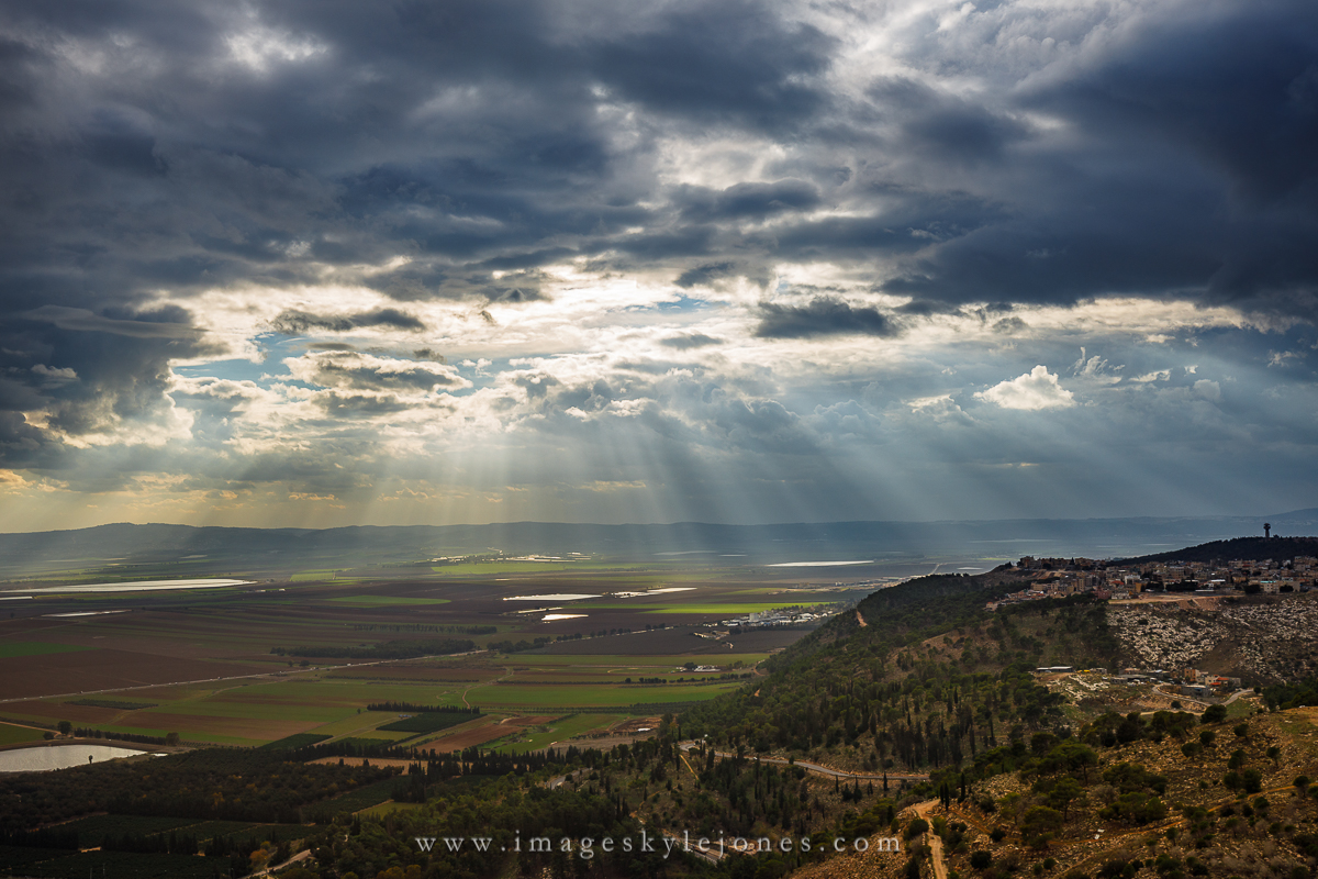
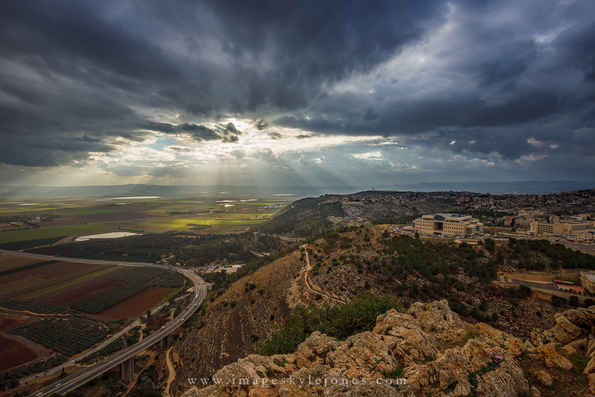
Here are two shots from Mount Precipice in Nazareth, Israel looking over the Armageddon Valley. We had some amazing clouds and God beams, which seemed strangely appropriate for the location.

I wanted to emphasize the light and drama, so I processed accordingly. I'd be interested in people's preferences between the images as well as any processing thoughts. Yes some of the spots in the sky are kind of hot, no they aren't at 255.

0457 Mt Precipice Beams_850.jpg

0460 Mt Precipice Wide_850.jpg
 

AlanLichty

Moderator
First one seems like a more intimate scene with the semi-pastoral setting and the nice skies/rays. The atmospherics in the second one are really nice but the freeway and campus type building complex on the right takes a lot of the mood away from the setting. You can crop up to just past the freeway but that still leaves a lot of obvious development in the scene.

The question back to you is what is the mood you wish to convey for the subject?
 

Ben Egbert

Forum Helper
Staff member
I Agree with Alan here. I see nothing wrong with the processing and both are very powerful for the atmospherics. But I wish there were no development in them, so the first is my favorite. I would clone out that patch of road at bottom right, Not because its a road, but because it draws the eye. The rest of the road can stay. Or you could crop off the bottom.
 

MonikaC

Well-Known Member
I'll be devils advocate here: I think that the roads in the 2nd shot make nice leading lines into the God beams. The buildings maybe sort of do, but detract equally.

It makes a pretty good B&W, too. I took a liberty & did a quick & dirty version here.
0460 Mt Precipice Wide_850.jpg
 

JimFox

Moderator
Staff member
Hey Kyle,

Very cool work here. I like the mood you are presenting here, good choice with the processing.

I like both with a preference for #2 because of the rays going both down and up in it.

I would suggest a crop for each though with maybe a pano format as a result. I would lose the top 1/4 of the sky in #1. In #2, I would crop from the bottom. My idea though hard to communicate would be to crop up to the very bottom of the 2nd road support from the bottom. Losing where the road then swings towards the left decreases the distraction from the road by almost 90% to my eyes.

No matter what you choose, what a cool experience.
 

Kyle Jones

Moderator
First one seems like a more intimate scene with the semi-pastoral setting and the nice skies/rays. The atmospherics in the second one are really nice but the freeway and campus type building complex on the right takes a lot of the mood away from the setting. You can crop up to just past the freeway but that still leaves a lot of obvious development in the scene.

The question back to you is what is the mood you wish to convey for the subject?
Thanks Alan - you hit on my dilemma pretty well. I really like the light in the second, and kind of like the rocks in the foreground as well. But it is definitely more "industrial". It is the light beams that drew me to these compositions, so I guess I'd be wanting to maximize the impact of those.

I Agree with Alan here. I see nothing wrong with the processing and both are very powerful for the atmospherics. But I wish there were no development in them, so the first is my favorite. I would clone out that patch of road at bottom right, Not because its a road, but because it draws the eye. The rest of the road can stay. Or you could crop off the bottom.
Good call on the road Ben - that's an easy one!

I'll be devils advocate here: I think that the roads in the 2nd shot make nice leading lines into the God beams. The buildings maybe sort of do, but detract equally.

It makes a pretty good B&W, too. I took a liberty & did a quick & dirty version here.
View attachment 14811
Thanks Monika - I like the B&W

Hey Kyle,

Very cool work here. I like the mood you are presenting here, good choice with the processing.

I like both with a preference for #2 because of the rays going both down and up in it.

I would suggest a crop for each though with maybe a pano format as a result. I would lose the top 1/4 of the sky in #1. In #2, I would crop from the bottom. My idea though hard to communicate would be to crop up to the very bottom of the 2nd road support from the bottom. Losing where the road then swings towards the left decreases the distraction from the road by almost 90% to my eyes.

No matter what you choose, what a cool experience.
I agree with your thought on the 2nd (rays down and up). I'll take a look at your crop suggestions - good thoughts!
 
Top Bottom