Moulton Barn for critique

Ben Egbert

Forum Helper
Staff member
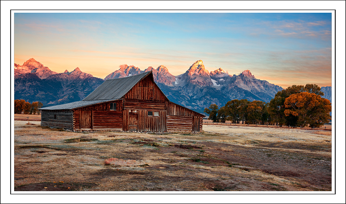
Here is an image from my recent Teton trip. It's not presentation quality, but not a tosser either in my opinion. Show me how you would finish this. I have taken it much further in regard to color and drama but in this case, no Topaz Studio or much saturation.

Link to the raw.
https://we.tl/t-cpSTVqY1H0


180925-8814-5DS RA.jpg
 

Jameel Hyder

Moderator
Staff member
Here is my cut at it Ben. I did a little horizon straightening, cropped to a 16x9 format losing some foreground. Warmed up a bit and applied some topaz adjust.

180925-8814-5DS R.jpg
 

Ben Egbert

Forum Helper
Staff member
Thanks Jameel. This looks good. Mine is more blue in the sky, but you picked up more color in the sky and peaks. I also did the straitening and cropping.
 

JimFox

Moderator
Staff member
That's what I caught too Ben, I like what Jameel did with the peaks since I think they are too hot and have lost detail in yours, but I like the blue in the sky that is in your edit. I think Jameel should restrict the warming from the sky and then it looks pretty good.
 

JimFox

Moderator
Staff member
One thing you could try in this is to slightly brighten the trees. Not a lot to where it's obvious, but just a little bit to make the fall colors pop a little more.
 

Ben Egbert

Forum Helper
Staff member
Thanks Jim, by hot you mean overexposed not warm? Jameel's are much redder which in my parlance is warmer.
 

Ben Egbert

Forum Helper
Staff member
I think this is better, the last one had a clumsy gradiant mask. This time I did a light and dark conversion and blended them to get the darker sky and mountains.

180925-8814-5DS R D.jpg
 

Ben Egbert

Forum Helper
Staff member
Thanks Amy, I like your crop. Probably a bit darker than I recall. But it does a good job on the sky.
 

JimFox

Moderator
Staff member
Hey Amy, I like what you have going on there too. I would suggest brightening up the ground layer more. I would specifically brighten the barn and the trees and perhaps the ground in front of the barn a bit.
 

AlanLichty

Moderator
My turn. I tried to keep it fairly neutral from the original while still making an effort to tame the highlights and enhance focus on the subjects in the scene. Most of the color work was done in Lightroom and contrast and detail was done with Topaz AI Clear and Topaz Precision Contrast. Finally a bit of burn and dodge work to tease out a bit more selective light to finish it off.

BensBarn.jpg
 

Ben Egbert

Forum Helper
Staff member
My turn. I tried to keep it fairly neutral from the original while still making an effort to tame the highlights and enhance focus on the subjects in the scene. Most of the color work was done in Lightroom and contrast and detail was done with Topaz AI Clear and Topaz Precision Contrast. Finally a bit of burn and dodge work to tease out a bit more selective light to finish it off.

View attachment 14735
Alan, thanks for chiming in. I like your foreground a lot, I might bump the sat in the peaks and sky, but otherwise I like it a lot. I might also crop off some of that foreground.

Here is a quick go at it ;)

View attachment 14743
Thanks Darcy. You have a very balanced look here. It has a natural look.
 

Mike Lewis

Staff Member
I think I like Ben's redo, but perhaps tone down the contrast a little, as it seems to be a bit harsher than the original. I do like the extra pop in the trees in that one though.

ML
 

Ben Egbert

Forum Helper
Staff member
Thanks Mike, glad you commented on this last redo. I hear you on the contrast, I tend to go a bit too far in that regard, I will take a look at it one more time.
 

Amy Nelson

Well-Known Member
"The negative is comparable to the composer's score and the print to its performance. Each performance differs in subtle ways." Ansel Adams
 
Top Bottom