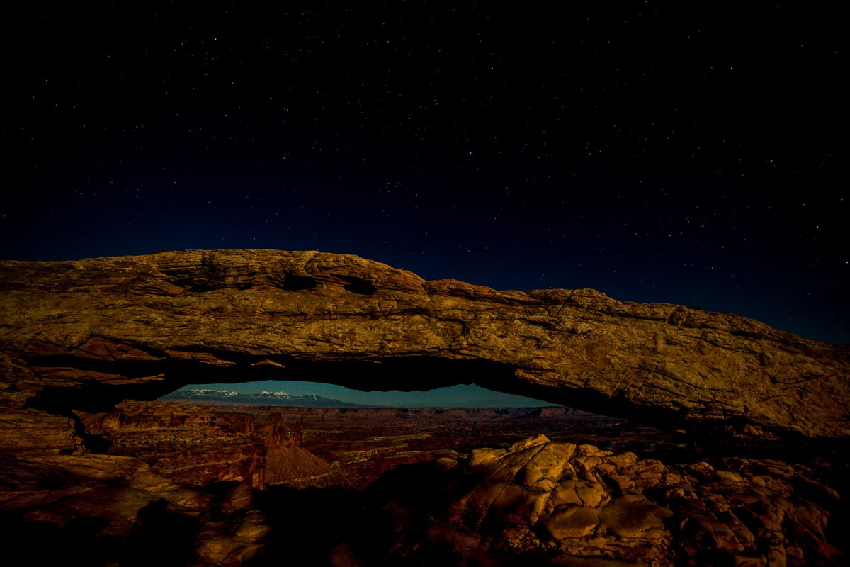
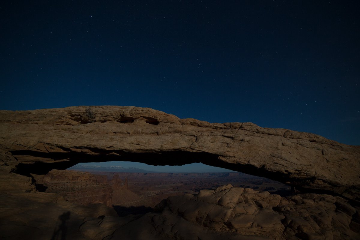
This is the second of my series of Icons shots taken by the light of a full moon. I will post a version using my current PP methods for moonlit shots as well as a straight out of camera RAW that has only been downsized and saved as JPG.
Feel free to download either image and play with them to show how you would work it.
Like to have opinions on any aspect, but in particular.
1. Too dark?
2. Lacking a milky way, it's not special enough?
3. Color (WB choices)
4. Needs more emphasis on the sky.
5. Lower shadows distract?
6. Composition?
Lets see if we can kickstart this forum.
Ben
Last edited:
") Thanks for letting us play with it.
Thanks for letting us play with it.