How about some opinions on this image? Added image

Ben Egbert

Forum Helper
Staff member
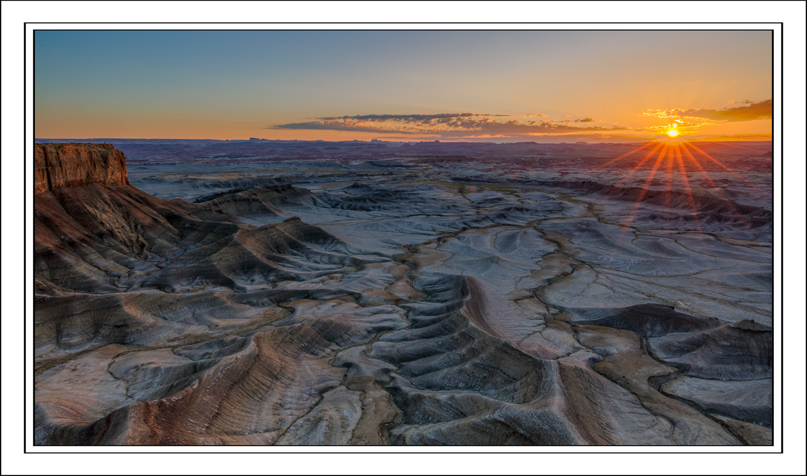
This passed the first test when sorting through my raw images. But it did not make it as a presentation quality image. I would like for you folks to pick it apart. I may find reasons that are mere impressions to me, but can be stated more clearly by other eyes.

Not trying to fix, it just understand it.


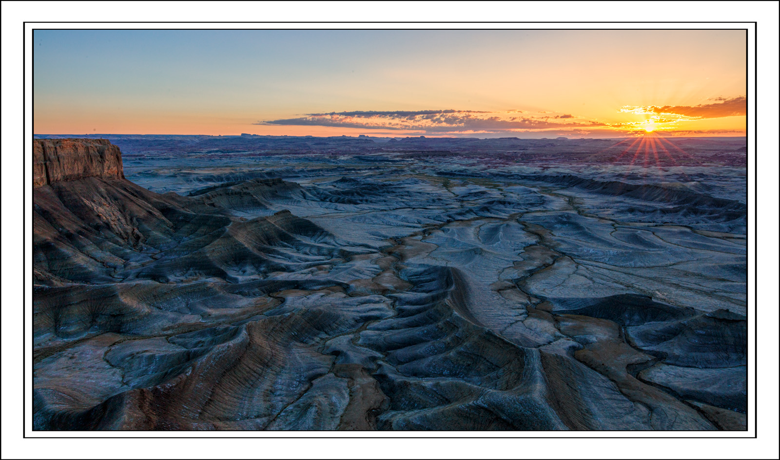
Here is a different image from earlier in the morning, same framing.

 
Last edited:

Kyle Jones

Moderator
My first, off the cuff thought is that the interesting part of the landscape is all in the lower left. The only thing with any visual mass in the upper right. Basically I think those elements are a little too far apart and the interesting landscape too close to the edge of the frame.

Although frankly I do like the image. Cool details in the land and some nice light.
 

Ben Egbert

Forum Helper
Staff member
Thanks Kyle, I had not seen it this way, but now I can't unsee it. I wanted the sunstar and the left cliff so I went wide. I would have been better off focusing on the cliff and omitting the sunstar.
 

Jameel Hyder

Moderator
Staff member
Agree with Kyle.

Also it may be the phone I am looking at this image on, but it appears a bit soft. Adding some sharpness and micro contrast esp on the lower left will help.
 

JimFox

Moderator
Staff member
My first impression Ben is that the sunstar is too overpowering. I like the idea of the sunstar, but in this case the rays from it cover such a large portion of the screen that it visually now dominates the scene, rather then being an anchor to it. If those rays had been only half the size they are, I think this would work totally. Do you have the same scene without the sunstar?
 

AlanLichty

Moderator
As I look into the scene everything in the lower left brings my focus up towards the center of the scene but there are no details in that part of the scene to grab my attention. I think the gap between the sunstar and the cliffs is just too wide for this comp to work. I like the elements in the scene but as a comp they don't quite work right.
 

Ben Egbert

Forum Helper
Staff member
Agree with Kyle.

Also it may be the phone I am looking at this image on, but it appears a bit soft. Adding some sharpness and micro contrast esp on the lower left will help.
Thanks Jameel, I am pretty sure it's sharp, but the countours in this area are very smooth so it may look soft for that reason.

My first impression Ben is that the sunstar is too overpowering. I like the idea of the sunstar, but in this case the rays from it cover such a large portion of the screen that it visually now dominates the scene, rather then being an anchor to it. If those rays had been only half the size they are, I think this would work totally. Do you have the same scene without the sunstar?
Hi Jim, I may have a smaller sunstar, and I certainly have many other shots from this morning, the best have already been posted, I may dig around and show some. I believe they are mostly at different focal lengths and direction however, so I doubt I have many other of this direction and FL.

I am pretty sure this was not the scene I wanted and probably went wide just to inclued the sunstar.
 

Ben Egbert

Forum Helper
Staff member
As I look into the scene everything in the lower left brings my focus up towards the center of the scene but there are no details in that part of the scene to grab my attention. I think the gap between the sunstar and the cliffs is just too wide for this comp to work. I like the elements in the scene but as a comp they don't quite work right.
I am pretty sure that is the problem. As I mentioned, I had another composition in mind when I saw where the sun was coming up, I went wider to get it into the frame rather than move, which I doubt I had time for.
 

Ben Egbert

Forum Helper
Staff member
For Jim, I found one taken earlier in the sunrise with a smaller sunstar albeit a very different wb. Not that he WB is bad, just that it will make comparisons harder.
 

BarryHamilton

Founding Member
I see what the others are saying, but I don't have a problem with the separation. To my eyes it aids in the feeling of being wide open country.
Nice imaging regardless!
 

Beth

Well-Known Member
i think the comp. could work if you added a lot more contrast in the lower left, mainly in the highlights more than shadows.
 
Top Bottom