Glacier composition challenge pt 2 image added

Ben Egbert

Forum Helper
Staff member
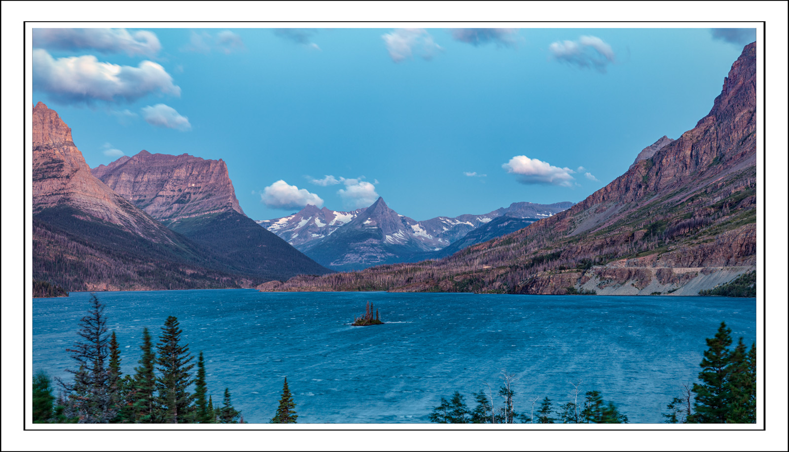
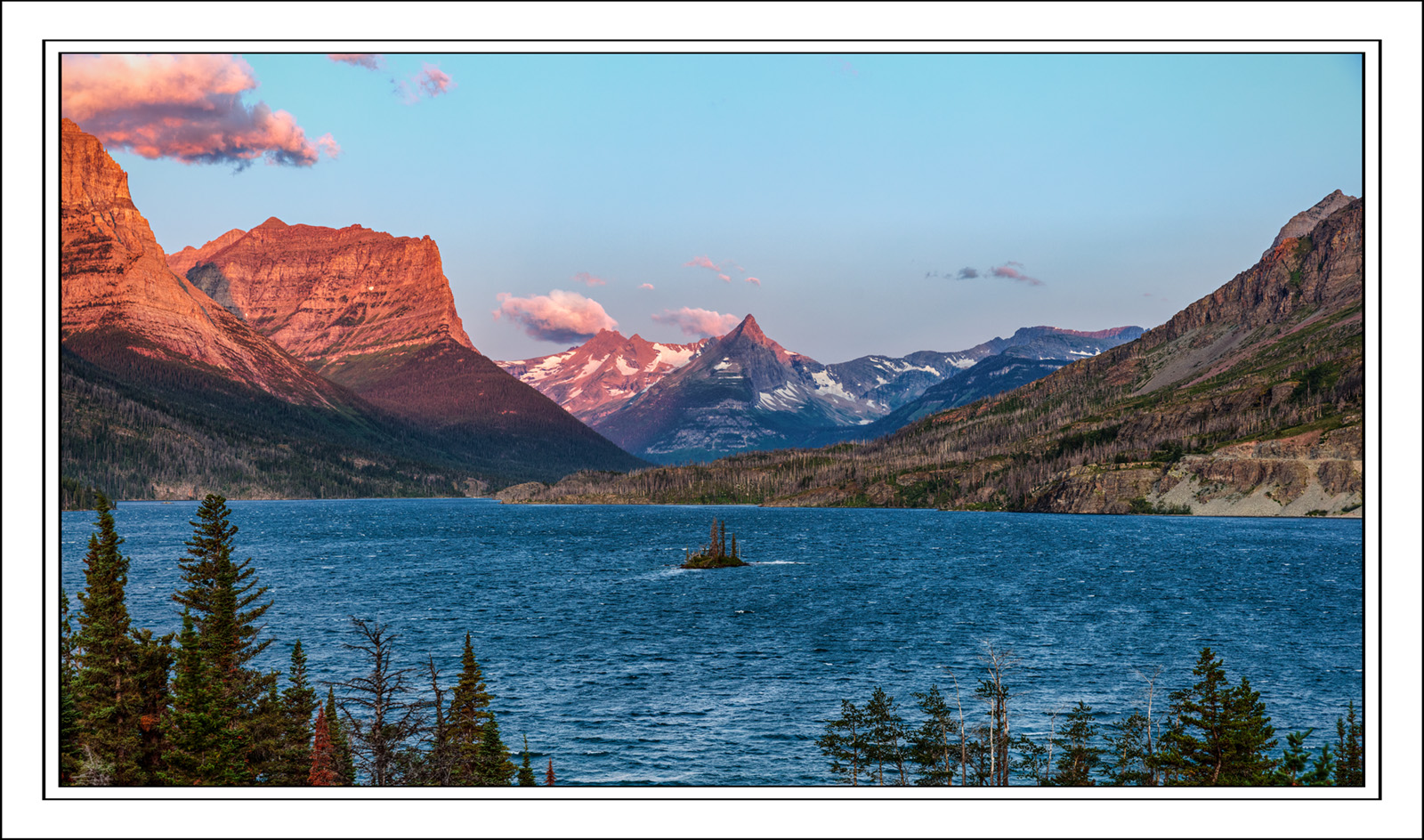
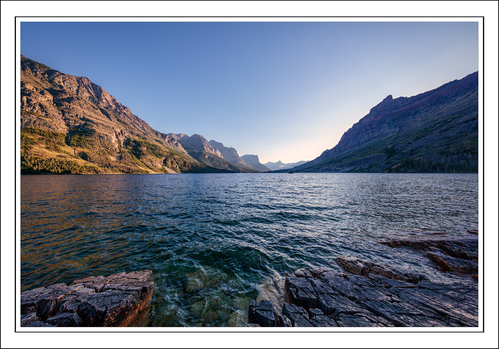
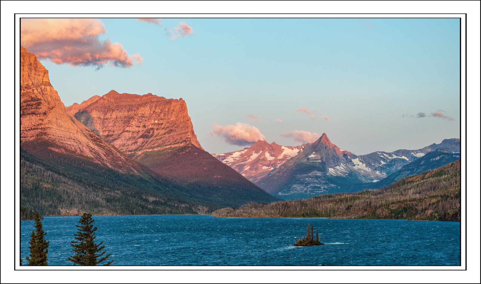
Here are two more images from the St Mary's lake Wild Goose Island view area. Both are flawed, the first by wind, but I want for you to comment on the composition. These were both taken somewhat down the slope from the parking area, and where I could include the island. For what it's worth the island also has dead trees, and might just as easily be ignored.

Just prior to sunrise.


Just a bit after the sun came up.
 

AlanLichty

Moderator
This is more like what I have seen for a water surface on St. Mary Lake during fall visits - endless wind chop. I like the more blue hour light in the first image given the mostly clear skies with more interesting contrasts for the clouds.

That said for my tastes the second one is the stronger composition that avoids the dead center bullseye elements in the first image. That one distant pointy peak (Citadel Mountain?) is just too strong to be dead center in the scene. The second composition has a better distribution of prominent elements that are close to the "thirds" locations in the frame. I like the island placement in the frame of the second image. That shot with the blue light skies and calm water would be a serious wall hanger candidate.
 

Jameel Hyder

Moderator
Staff member
In addition to Alan’s comments, the tree tips are a distraction. There isn’t enough of the trees to add a foreground interest. I’d consider cloning it out.
 

JimFox

Moderator
Staff member
Hey Ben,

I think #1 is the strongest here, but it's major flaw to me is that there are not enough trees at the bottom of the frame. I would like to see a bit more of the bottom so that the trees totally anchored the shot and not feel like they are poking up into the shot. I could use less sky since the clouds at the top are very high in the frame. If you have one where you angled down a bit, I think that would be great.

Not sure why, but Wild Goose Island seems like a distraction in #2. I know those 2 tall trees poking up from the bottom on the left keep drawing my eye too. So I think the combo of those 2 trees and the island are just 2 distracting in that comp so that I can't enjoy the background.
 

MonikaC

Well-Known Member
I second Jameel & Jim with the tree tops being a distraction. And with the island being a distraction in #2. I think with so little of the water showing, the island is more prominent & not as well placed as in #1.
 

Beth

Well-Known Member
i prefer the comp. and light of the second one, but i think it could be improved by removing the trees. for me the second one works better than the cropped version of the first because the slopes of the mountains all point to the island. they do in the second, but the blue light and lower contrast doesn't emphasize the lines as much.
 

Ben Egbert

Forum Helper
Staff member
In addition to Alan’s comments, the tree tips are a distraction. There isn’t enough of the trees to add a foreground interest. I’d consider cloning it out.
I have considered that option. Also at full size there is a lot of wind motion blur. Not sure how well this will clone, or if the image is worth it. But maybe next time I would choose a different composition.

Hey Ben,

I think #1 is the strongest here, but it's major flaw to me is that there are not enough trees at the bottom of the frame. I would like to see a bit more of the bottom so that the trees totally anchored the shot and not feel like they are poking up into the shot. I could use less sky since the clouds at the top are very high in the frame. If you have one where you angled down a bit, I think that would be great.

Not sure why, but Wild Goose Island seems like a distraction in #2. I know those 2 tall trees poking up from the bottom on the left keep drawing my eye too. So I think the combo of those 2 trees and the island are just 2 distracting in that comp so that I can't enjoy the background.
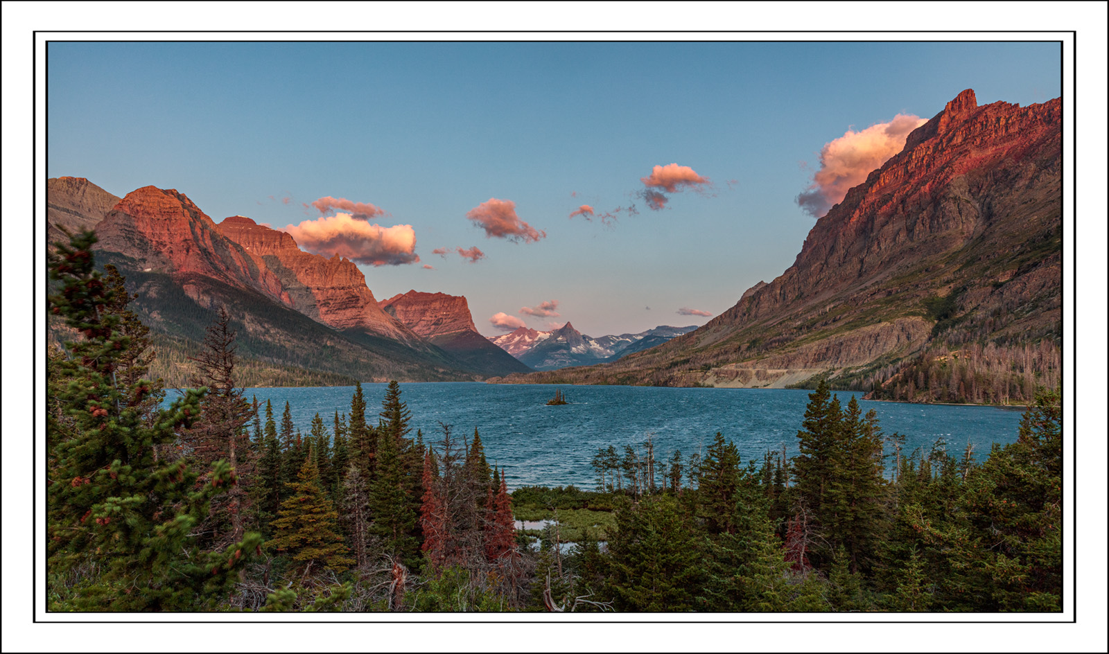
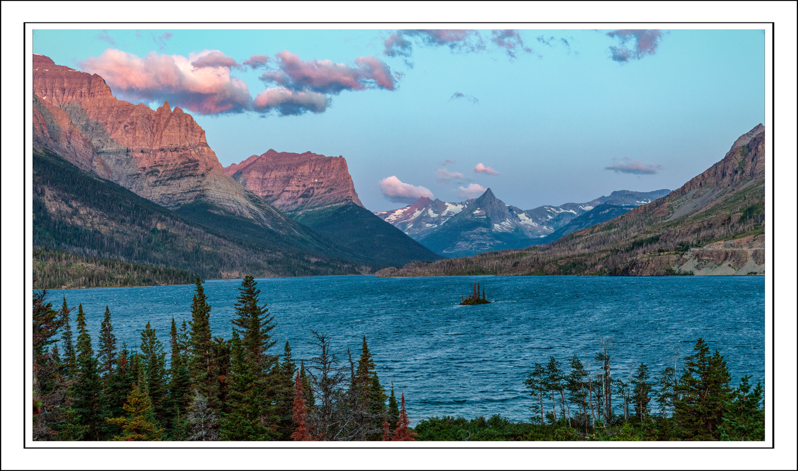
Jim, I am going to post three more comps from this day at the end of this thread. They will have various amounts of additional bottom weight. They are all burdened with dead trees. You may recall the one I took and posted that was from waters edge. These samples in this thread are what prompted me to solve the tree issue by getting all the way below them. I just wish I had some color in that one.

I second Jameel & Jim with the tree tops being a distraction. And with the island being a distraction in #2. I think with so little of the water showing, the island is more prominent & not as well placed as in #1.
I am not sure there is a good comp that features the island in a favorable way these days. I am inclined to ignore it as a subject.

i prefer the comp. and light of the second one, but i think it could be improved by removing the trees. for me the second one works better than the cropped version of the first because the slopes of the mountains all point to the island. they do in the second, but the blue light and lower contrast doesn't emphasize the lines as much.
Check out some of the images I will be posting below and let me know if any work for you. None of them really solve the island-tree problem. I will post another days image that completely eliminates the tress and hides the islands later.
 

AlanLichty

Moderator
I am with Jameel for the second group - #2 stands out. This is where Kyle's color edit for the dead trees yesterday would help. There is just enough at the bottom for a good visual anchor and the first rays of sunlight are the best of the bunch.
 

Beth

Well-Known Member
#2 of the new batch for me for the same reasons as alan. there's now enough of the trees to make them relevant to the image. the mountains now sweep towards the general area in the center of the image and that takes away from the importance of goose island in the comp, but as a whole i think it works.
 

Kyle Jones

Moderator
I'm with the others. I like the gap in the trees with the small ponds in front of the island and the sky/foreground look pretty well balanced.
 

JimFox

Moderator
Staff member
Hey Ben, I think #2 of this new group is a real winner. As long as it’s sharp enough, that’s just about perfect.

Between #1 and 3 which are tighter shots. I think I prefer #1 over #3, but I wish it had more trees at the bottom like as in #3.
 

Ben Egbert

Forum Helper
Staff member
Hey Ben, I think #2 of this new group is a real winner. As long as it’s sharp enough, that’s just about perfect.

Between #1 and 3 which are tighter shots. I think I prefer #1 over #3, but I wish it had more trees at the bottom like as in #3.
Thanks Jim, I probably have more trees, I usually crop to 16x9 and would have taken it off the bottom to get rid of some fairly ugly trees.

This is my favorite composition of St Marys lake, I just wish I had been here that same morning.

 
Top Bottom