Failure

Ken Rennie

Well-Known Member
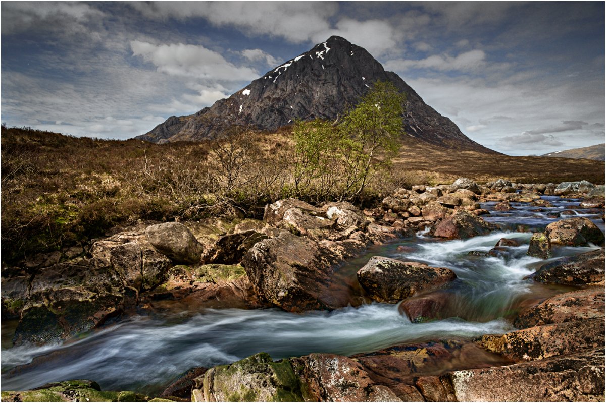
I don't often post failures but I think that this is one and is posted to show what you shouldn't do in terms of compositin. This is the River Coupall with Buachaille Etive Mor in the background. This image was taken in May 2014. Lovely light, good but not perfect river flow, nice sky, good foreground rocks, fresh foliage starting to sprout on the birch trees, still a touch of snow on that beautiful mountain. However I was still at the " I am taking the view" stage and not able to or more importantly not thinking that I should be able to see what exactly interested me in "the view". So instead of analysing what exactly interested me and then working out 1) where to put it in the picture space and 2) what I want in the foreground to lead the eye to the main focus and 3) what I want in the background. In stead I just moved to where I could put all of my favourite bits into the picture. I have just re-processed this image to ameleriorate the worst effects of my poor composition. Ken
First Sign of Spring 43-2.jpg
 

Ben Egbert

Forum Helper
Staff member
This would be a great one for the critique forum based on your analysis. I am probably guilty of the problems you present on most of my images, I just want to show everything. I am not sure I could even begin to critique this but perhaps you could crop to show the important elements. Or would it require a completely different location for your tripod?

No matter, I would love to have this image.
 

AlanLichty

Moderator
Not sure what all you did with edits from the original comp but this doesn't look like a bad image to me.

I do see a very workable portrait comp in the scene as you present it staying pretty close to the visible base of Buachaille Etive Mor
 

Ken Rennie

Well-Known Member
Ben I think that I need to reshoot things are just in the wrong place. I did not manage to get a good image that morning and I should have been able to get many. Everything was in place apart from the lack of thinking behind the viewfinder. I did get a nice image the previous evening but that was just a copy of a well known composition although I have no memory of having seen it before although I have seen it many many times since. Ken
 

JimFox

Moderator
Staff member
Hey Ken, it's great to post "failures" sometimes as it makes you think, and this case makes also makes us think.

2 things jumped out at me, maybe 3.

1. the river and how it runs almost across the image rather then out of the image.

2. tied into #1 I wish the river was exiting on the bottom and not the side.

3. Lot's of brown dead space in the middle left

The basic issue is the river doesn't provide an lead in line to the background.

I will move this to Critique, not that this can't be here but I think Ben makes a great point about images like this being in Critique, a place with thinkers tweak. :)
 

beavens

Forum Helper
I'm not a landscaper really, but to my eyes the left 1/4 of this shot isn't bringing anything to the table - especially with the limited foreground in play. Wider would work just fine if there were more of a foreground to stand on, and as shown I think that tightening things up will improve.

Aside from that, very nice to view. Perhaps a tad heavy on contrast, but my eyes aren't really complaining. :)

Jeff
 

Ben Egbert

Forum Helper
Staff member
Ken, here is how I would crop it. I wanted to get rid of the lower left rocks but keep the stream flowing out of that corner.

First Sign of Spring 43-2.jpg
 
Top Bottom