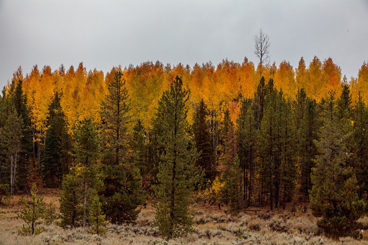
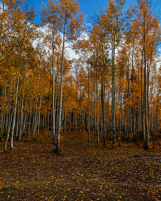
I camped in a grove of aspen while at Christmas Meadows and spent some time wondering around taking aspen shots. I tried to find compositions that allowed for level shooting to avoid distortion, I also tried to not cut off trunks above ground level and to avoid unwanted ground clutter. I did some with cut off tops and some with sky. I did some vertical and some horizontal. I also tried to avoid side clutter, like a messy tree.
Like to get your favorites and any comments that could improve that, or my overall approach to this.
1.
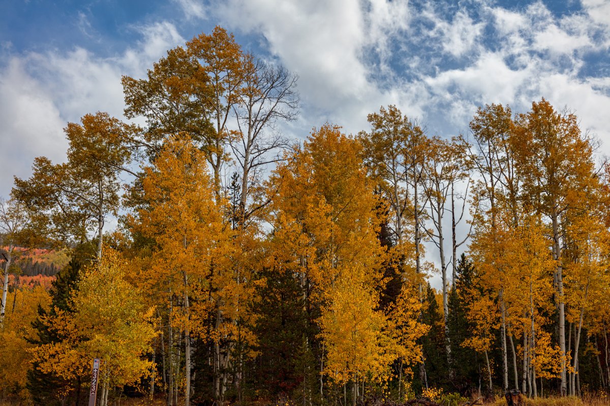
2
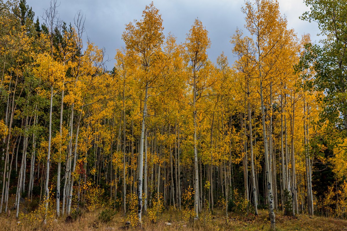
3
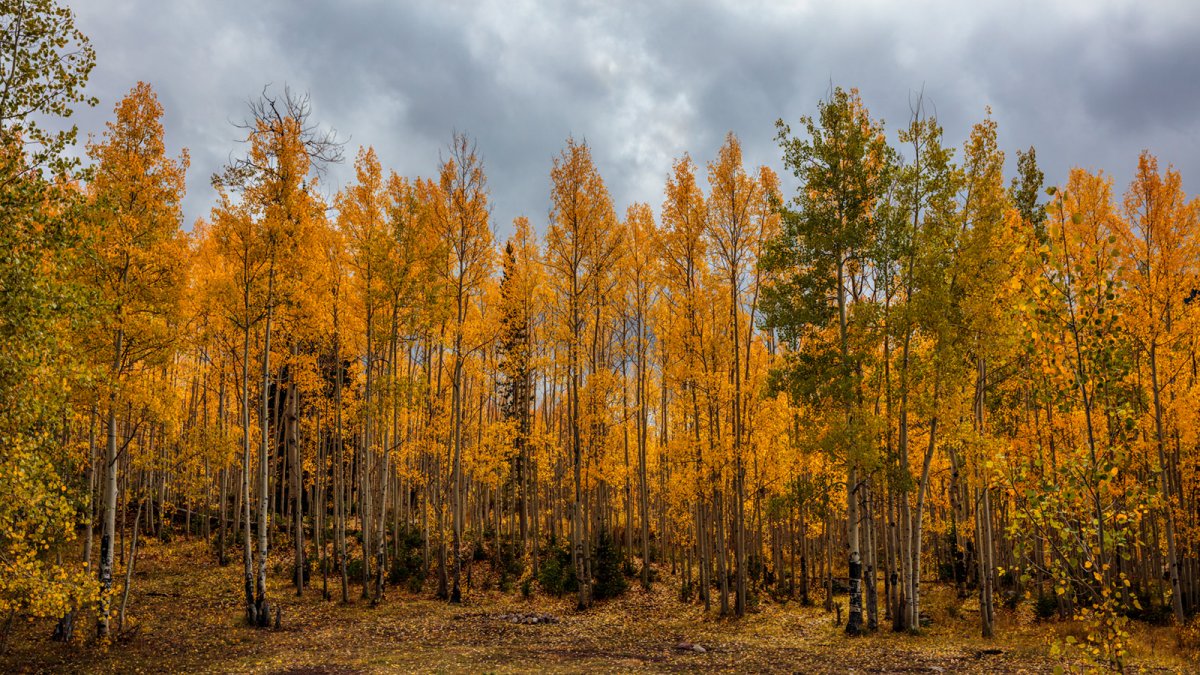
4
5
Like to get your favorites and any comments that could improve that, or my overall approach to this.
1.
2
3
4
5