Calibration 2 (new version)

Ben Egbert

Forum Helper
Staff member
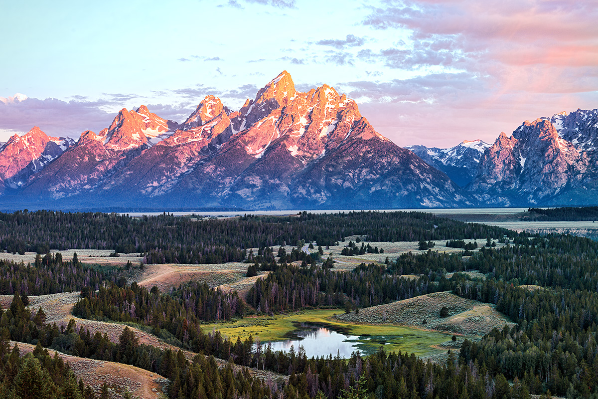
Here is another example of before and after processing. This is a 3 image stitch taken last year at the Tetons.

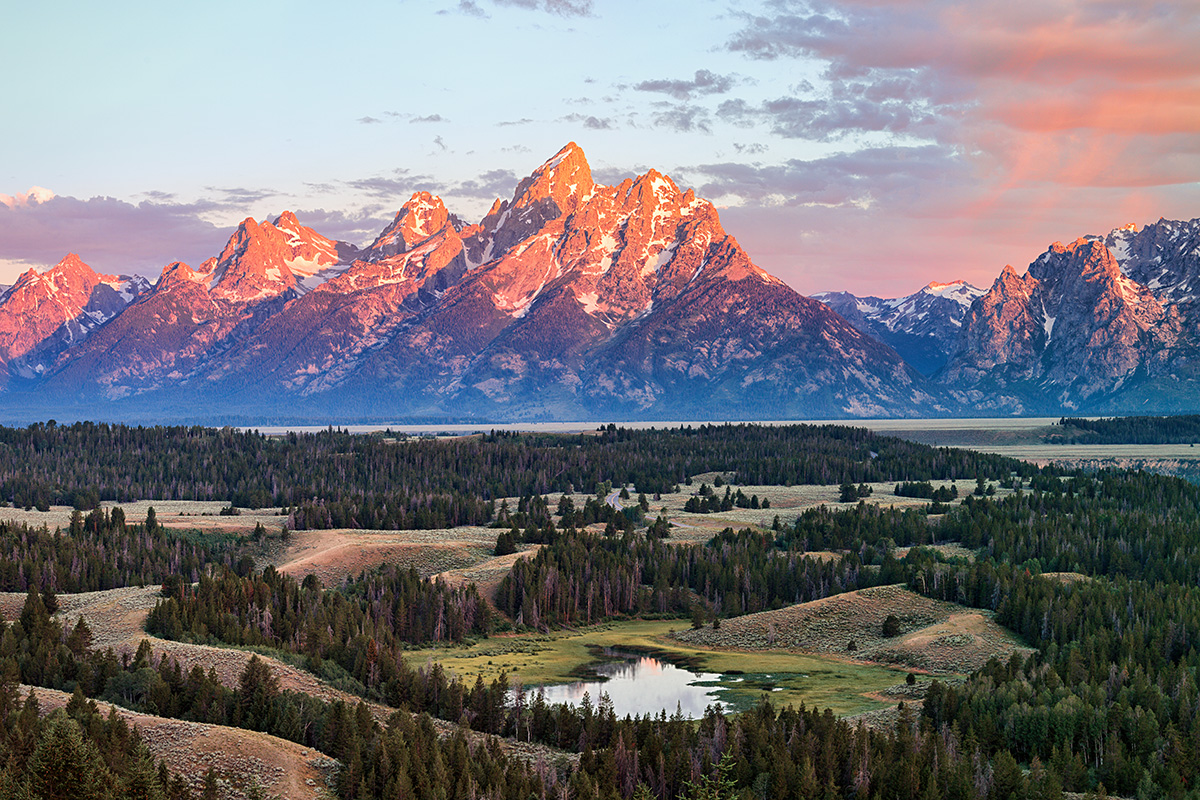
The first is my newer vision and the second is the prior vision which now looks over processed to me.

I would be interested in your opinion in that regard, and also what you think of the colors. Do they look right? My color vision is much improved, but that does not always mean my color sense is great.

New processing

170717-2297-300 PC.jpg


Old processing
170717-2297-2300 BW SHARP 30X45.jpg
 

Kyle Jones

Moderator
I'd agree that the mountains in the old version are over saturated, but the image does look nice. I think the new colors look good. I'd probably look at darkening the sky (especially the bluer area top left) and opening the shadows in the ground just a touch and call it good.
 

AlanLichty

Moderator
I like the new version a lot better. Agree with Kyle's assessment on the sky. Don't go overboard on opening up the shadows in the lower part - those look pretty good already.
 

JimFox

Moderator
Staff member
Interesting Ben.

I am with Kyle on darkening the sky more, but I would also darken the peaks too. Since your cataract surgery it seems that you are not detecting blown out area's or hot area's as well? I would say the peaks in your new edit are too hot and you are blowing some color as a result. So more then a color issue, I see you have to get used to brightness differently.

I actually like your original. I don't really see anything wrong with it. In this case for me, I think your goal would be to get your new processing to look like your old? I would not say that your old one was over processed at all. Perhaps with your cataract surgery you are now seeing things darker and more colorful then they really are?
 

Ben Egbert

Forum Helper
Staff member
Thanks Jim and Alan.

If anything everything is brighter, so I don't need to do as much shadow recovery. The other thing is that I don't need as much drama to carry the image.

I am pretty sure nothing is blown, but I think you probably mean too bright. Maybe not 255, but too close to it? Also realize I work on a monitor calibrated to 80 CD/mm^2, where most monitors might be well of 120.
 

Ben Egbert

Forum Helper
Staff member
Ok guys. I an loath to change my main monitor as it agrees with my prints very well. But i did brighten my second monitor to serve as a guide for web processing. Also note, now that I see how over processed my old images were, especially on reds and yellows, I am sort of creeping back up. I know how to get more drama, but how much more than was really there is the big question.

So here is a version where I darkened the sky and mountains left the foreground alone.

Let me know what you think here

170717-2297-300 PC A.jpg
 
Top Bottom