BW conversion -test run

Kurt Harrigan

Well-Known Member
I thought I would try a b/w conversion on this one to see if the taming of colors would provide a softer image. I converted to an appropriate b/w scheme (red filter) then selectively brought back some of the colors to add interest. I decided to do a reverse vignette on this to let things trail off to the edges and to provide a lighter feel to the image. The original that I worked off of is posted in the wildlife/nature section ("Paintbrush among Meadow Penstemon) if you feel inclined. As always, any thoughts or ideas would be appreciated......
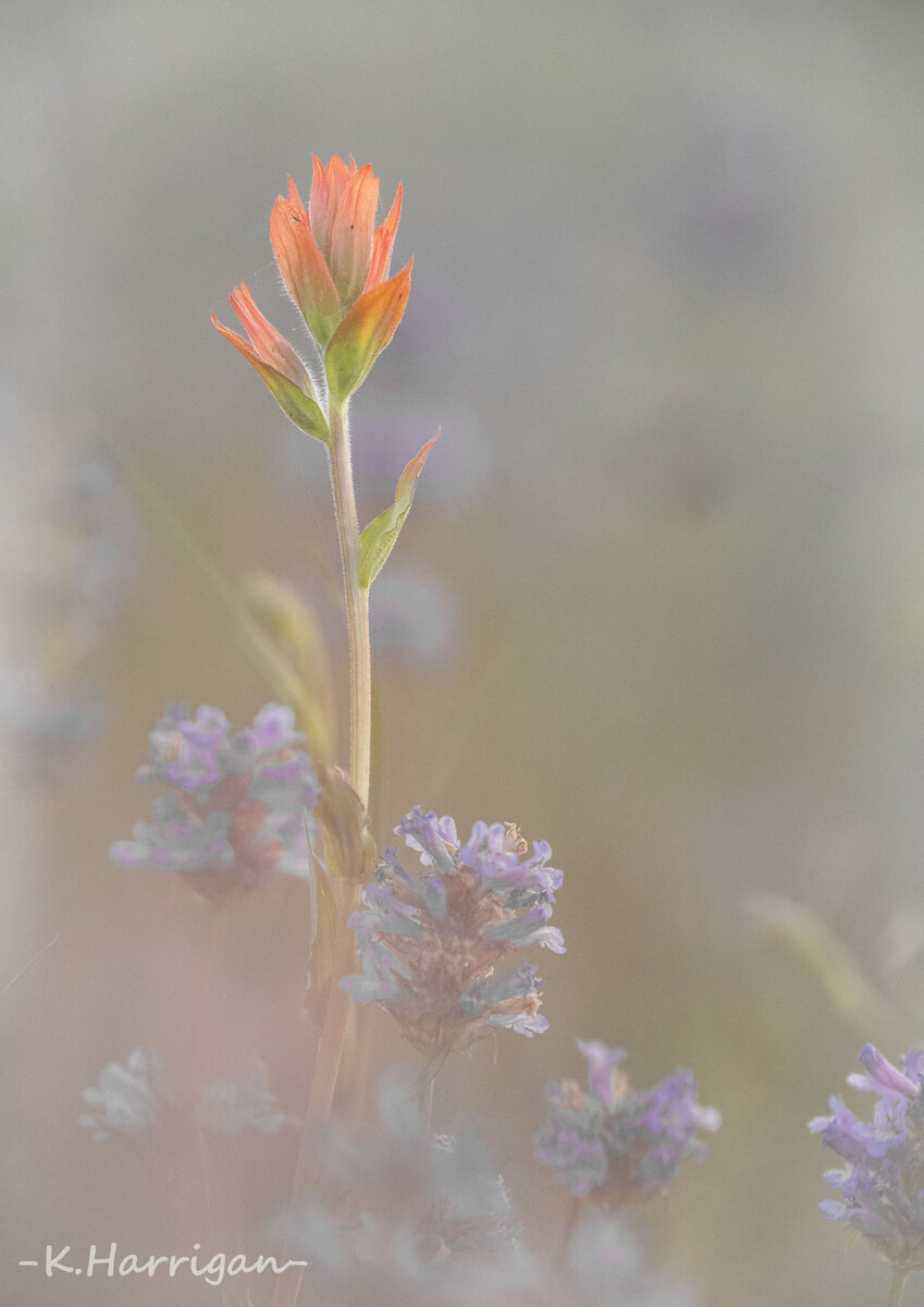
_DSC9380 copy.jpg
 

AlanLichty

Moderator
Interesting processing approach and I can see what you are trying to do here. Had I only seen this version I would be impressed with the result but I do find the richer colors in the original color version to be a bit more compelling and especially down in the lower left corner of the frame. I don't find the red hues in the OOF foreground blooms in the original version a distraction at all.
 

JimFox

Moderator
Staff member
This is really creative Kurt, great thinking and effort in trying something new. I really like this a lot. I think you could be on to something cool.
 
Top Bottom