Vote for best Schwabacher

Vote for best 2 images

  • #1

    Votes: 2 50.0%
  • #2

    Votes: 0 0.0%
  • #3

    Votes: 3 75.0%
  • #4

    Votes: 3 75.0%
  • #5

    Votes: 0 0.0%

  • Total voters
    4

Ben Egbert

Forum Helper
Staff member
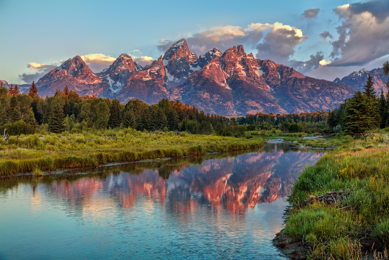
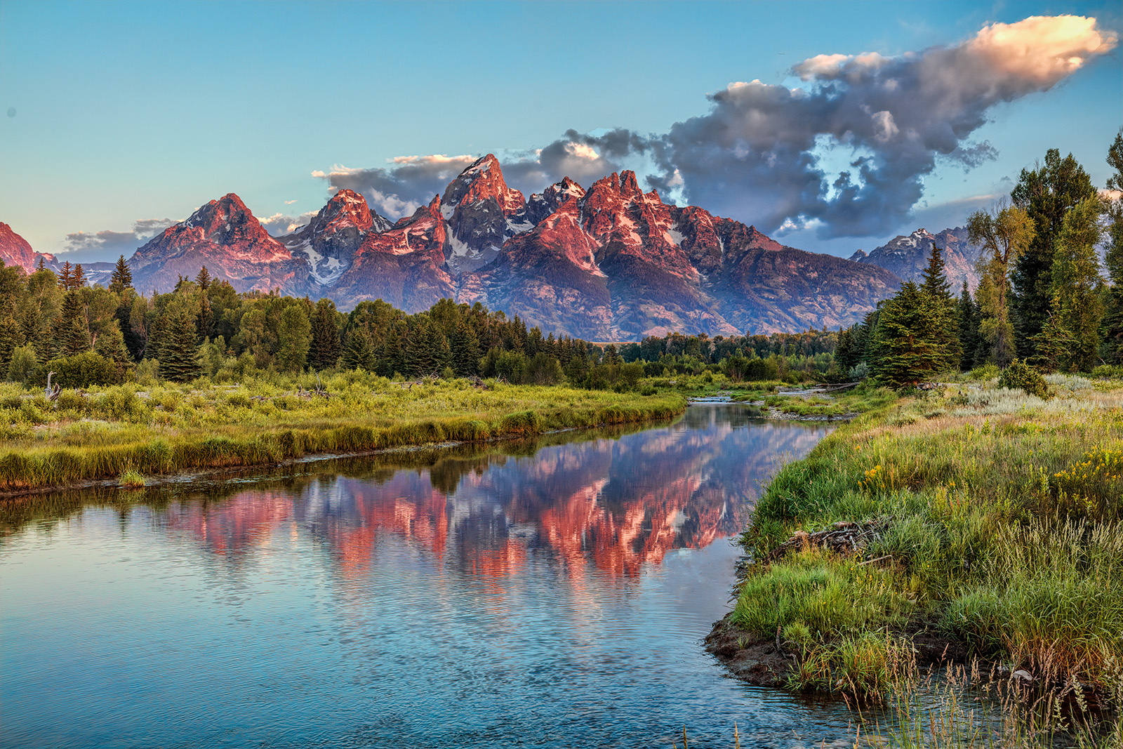
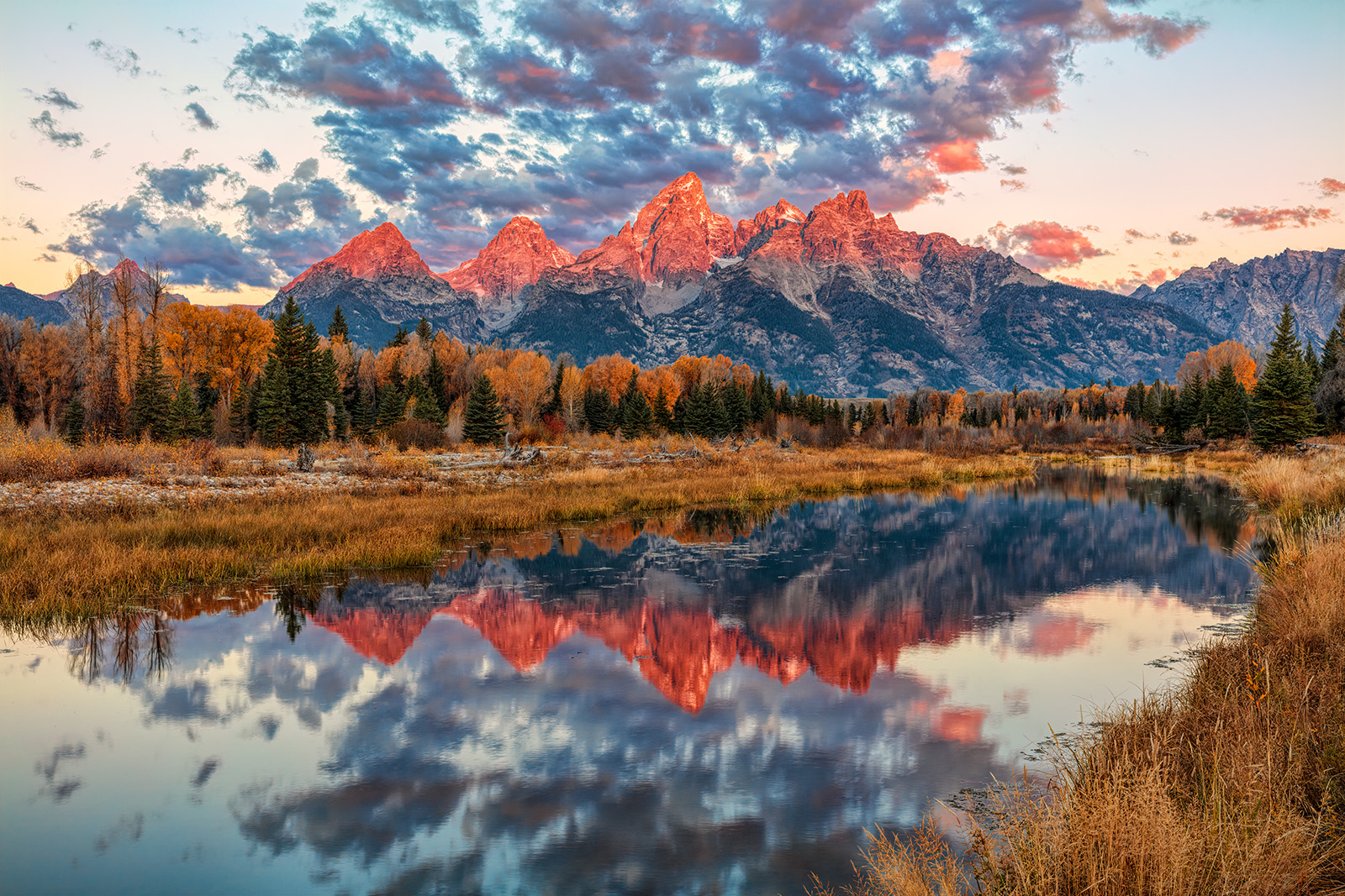
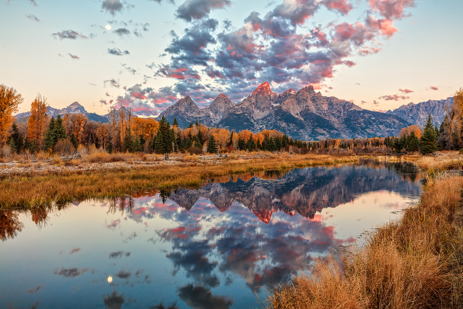
These images are my best from the parking area at Schwabacher Landing. I have been going through them and reprocessing per my latest methods. Like to hear you opinions both as to which you prefer and any comments you may have about the image itself or the processing and or how it should be cropped. These are all uncropped.

#1.

#2

#3.

#4


#5
 

Kyle Jones

Moderator
I voted for 3 and 4 - but it was tough because I really like each of the first 4a lot. The last one is too wide for me and the color isn't as nice as it is in 4.

Overall I think 4 is my favorite with the great clouds and color. I like the bit of extra curve in the shoreline too. I picked 3 over the first two primarily for the more dramatic light. I'd be excited to capture any of them - especially since my luck in Teton has never been great.
 

JimFox

Moderator
Staff member
Hey Ben, I went with #1 and 4.

#1 and 2 are the same image just #2 is wider. I think the way the cloud tails off up towards the upper right pulls the eye away and out of the image. In #1 while the clouds are heavier on the right, they don't pull the eye away.

#3, 4 and 5 are the same image with a slight bit of time difference and composing. So of that group I picked #4, though I can see why Kyle liked #3 also. The one I didn't like in hindsight is #5, though the moon is super cool in one aspect, the moon is really pulling at the eye and becoming a distraction I think. Maybe it's just me on that.
 

Ben Egbert

Forum Helper
Staff member
Thanks for your details reply Kyle. I also like 4. I have been shooting this scene since 2004 and you are right, most are lacking clouds or light or sometimes smoke covers them or clouds do. Getting there early enough to get the right location and then avoiding people in the shot is another issue. In the last one, I went wide to get all the clouds, knowing it messed up the comp. I was also trying to include the moon, but at this focal length it's too small to matter. 4 and 5 are from the same spot just moments apart. The others are a different year and season.
 

Ben Egbert

Forum Helper
Staff member
Hey Ben, I went with #1 and 4.

#1 and 2 are the same image just #2 is wider. I think the way the cloud tails off up towards the upper right pulls the eye away and out of the image. In #1 while the clouds are heavier on the right, they don't pull the eye away.

#3, 4 and 5 are the same image with a slight bit of time difference and composing. So of that group I picked #4, though I can see why Kyle liked #3 also. The one I didn't like in hindsight is #5, though the moon is super cool in one aspect, the moon is really pulling at the eye and becoming a distraction I think. Maybe it's just me on that.
Thanks Jim, I agree with all you say accept that 3 and 4 are different years and different seasons.
 

AlanLichty

Moderator
Like Kyle I ended up with #3 and #4 with #4 being my top choice. The clarity of the reflections in #4 as well as the overall composition and light were the primary drivers for that. I like the reflections and overall light in #5 but the mountains aren't as prominent and the sunlight just touching the tips of the peaks wasn't as dramatic as the first 4 images.
 

Ben Egbert

Forum Helper
Staff member
Like Kyle I ended up with #3 and #4 with #4 being my top choice. The clarity of the reflections in #4 as well as the overall composition and light were the primary drivers for that. I like the reflections and overall light in #5 but the mountains aren't as prominent and the sunlight just touching the tips of the peaks wasn't as dramatic as the first 4 images.
Thanks Alan, I agree and am glad to get the same impressions here as I had myself. Any issues with processing? Could 4 be cropped further?

I always automatically cropped my best images at 16x9 so I could print them larger, and many really want to be 2x3 aspect as these are. I find many images previously rejected are much better uncropped. Maybe I should have ponied up for a 24 inch printer.
 

AlanLichty

Moderator
Not sure I would want to crop #4 further. If anything trim a bit on the left but that starts to center the peaks a bit more than I would be inclined to do. You could possibly lighten up the darker parts of the clouds just a bit so they don't tend to pull my eyes up above the peaks.
 

Ben Egbert

Forum Helper
Staff member
Thanks Alan. I am just starting to learn that the clouds are secondary in an image like this.

Here is a crop of 4 keeping the 24x36 which is still a respectable 225 PPI.

I took some off the left and top. I may clone out the two clouds that touch the left edge in th sky and again in the reflection.

150929-2014-5DS- R 112919 crop.jpg
 
Last edited:
Top Bottom